
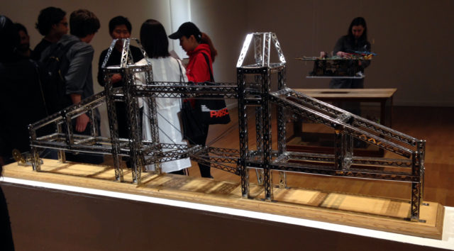
Chris Burden, “Tower of London Bridge,” 2003 at Shin Gallery.
Michael: In the belly of the beast that was Frieze Week, I met up with Patricia Margarita Hernandez, Gallery Director/Assistant Curator of P! to check out some openings in the gallery’s neighborhood. We ended up at two solo shows: Chris Burden at Shin Gallery and Patricia Treib at Bureau.
I liked both of them a lot more than she did. Below, we talk nerdy masculinity, whether abstract paintings have content beyond “decor”, weird curating, and bad lighting.
Chris Burden: Hobby Shop
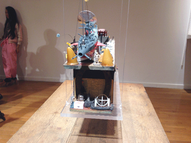
Chris Burden, “Warship,” 1981.
Shin Gallery
322 Grand St.
May 3 – Jun 18, 2017
What’s On View: Two Chris Burden model-like sculptures, “Warship” (1981), and “Tower of London Bridge,” (2003) alongside 1975 concept car sketches. “Warship” looks like an aircraft carrier assembled from junk suspended from the ceiling, floating over a wunderkammer of “guy toys”—matchbox cars, a wartime gas mask, and other military accoutrements.
Michael: This is some of the smartest curation I’ve seen in Shin Gallery’s main exhibition space. In the past, I’ve been impressed with their installations in the project space, but their showroom has been a bit uneven. Regardless, Shin brings a certain enthusiasm to their shows that’s sometimes lacking in the commercial gallery circuit, and for that I always look forward to seeing what they’re showing and how.
It seems like they hit their stride here. Hobby Shop has precious few pieces from the late Chris Burden, but they tell a cohesive story—despite spanning nearly 30 years. The goofy 1975 concept sketches for “B-Car” aren’t really anything to write home about (they look like a tween’s Logan’s Run fan art) but point to Burden’s obsession with engineering that binds the show together. His 70’s output is mostly known for masochistic, thrill-seeking performances and these might point to the nerdier side of masculinity?
I like seeing this tween-boy sense of play carry through to “Tower of London Bridge” decades later (built with an “erector” set… LOL). Burden’s father was an engineer, and it’s kinda touching to think the artist spent the later decades of his life working through that legacy. I’m thinking of his “Twin Quasi-Legal Skyscrapers” on the roof of the New Museum as the end of a process that began with those humble car sketches. There was something satisfying about knowing that was one of his last major projects and then seeing the “Build A Skyscraper” model kit embedded in the bowels of his 1981 “Warship”. Decades later, that ambition came true.
Patti: The first thing that stands out to me is your use of the word showroom. It is such an appropriate word for a strictly commercial gallery. I imagine using “showroom” in conversation with Gavin Brown about the gallery and i’m sure he would not be pleased. I am curious what you mean by “a certain enthusiasm” that Shin Gallery has that other galleries don’t?
Michael: Well, they commit really fully to whacky, impractical presentation concepts. [Full disclosure: my niece used to work at Shin Gallery]. They often do installs that don’t make a lot of sense from a strictly commercial model or even a conventional curatorial mindset—once they hung a single Baldessari in the gallery and surrounded it with a ball pit. Another time they created this bizarre installation of a fictional studio shared by Sigmar Polke and Martin Kippenberger in their project space, complete with 1980s West German newspapers and cigarette butts on the floor. Last summer, they turned it into a mini CBGBs (including graffiti-ed urinals) and invited punk bands to play all day. My personal favorite install was a pop-up massage parlor to show Nobuyoshi Araki’s fetish Polaroids, which were displayed under a plexiglass floor so you actually had to walk on them to see the whole show. It was so convincing in its detail that drunk bros apparently kept stumbling in looking for a “happy ending”.
I’m literally always surprised (for better or for worse) by whatever the hell happens there, and that’s something I appreciate more than anything. This unconventional thinking might come from the fact that the owner was a collector before a gallerist, and seems to make decisions based on personal interests and impulses rather than an audience or client’s expectations. I respect that. Somehow all the theatricality feels like more than marketing spectacle—it’s fanboy devotion. You get the vibe that this is someone who truly loves art in a very weird way and wants people to have fun with it rather than see it end up accruing value in a storage locker next to the Luxembourg airport. It’s more than just a business, it’s a passion project, which is more than I can say about most soulless secondary market outlets.
Patti: I don’t believe art is ever removed from the market. Sometimes I just see it as a business like any other.
Michael: Well, yeah! But it’s also the most illogical market, and I kind of love that. What other kind of retail venture places four objects—two shitty pencil drawings of sci fi cars and two models literally made from children’s toys—in a ridiculously high-rent storefront space and gives people drinks in exchange for looking at them?
Patti: I’m not sure what to say about these works. If I hadn’t have know they were the work of Chris Burden, I would have completely dismissed them. Not to mention the hang did them no justice and the lighting was totally wrong. Then the swastika patch threw me off and I couldn’t help but imagine some hoarder in the woods putting these together. We were also drinking hot beer. LOL. In the context of knowing Burden’s work from the 70s, these seemed to be working through other ideas. Like a task that one does to distract their mind as they process other things.
Michael: I love that obsessive recluse hoarder quality, which here doesn’t read like an affectation (somewhat of a cliché aesthetic to try on) but just feels like honest, playful nerdery. You’re so right about the lighting. It was underlit to the point of feeling like a candlelight vigil for Burden, which ran counterintuitive to the anti-precious nature of his work.
I didn’t read too much into the swastika—I think of that piece as a WWII battleship model with an absurd addition—but again, you’re right. It totally wouldn’t fly in 2017.
Patricia Treib: Interstices
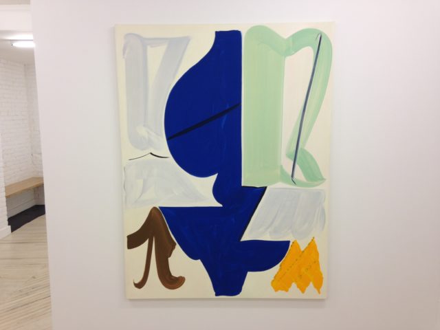
Patricia Treib, “Enfold,” oil on canvas, 2017. 66 x 50 inches
Bureau
178 Norfolk Street
May 3 – June 18, 2017
What’s On View: Seven large, colorful abstract oil paintings from Patricia Treib. Each feature 5 to 7 large shapes in various colors on a white or cream background.
Michael: Treib’s work is so lovely—a real crowd-pleaser. That’s evidenced by the opening being packed to the point that it was nearly impossible to see the paintings unless you were right in front of them, despite the fact that they were hung with generous spacing. That has it’s own rewards though, because Treib’s handling of paint is so calligraphic and fluid photography doesn’t do it justice—you want to see these up-close and personal.
Like the Burden, though, I got the impression you weren’t as into the show as I was? What’s not to love?
Patti: Well, for starters, the show’s press release! It begins:
“Treib’s canvases skirt the lyrical. She masses colors, one beside the next, so precisely that the subtle spaces or overlaps between them begin to feel physical, like a body’s close proximity or one falling away in absence.”
The tone of this got under my skin, in particular “skirt the lyrical.” That being said, Treib’s intentionally direct and expressive brushstrokes feel like she’s developed her own language. But this language is haunted by painting’s historical context. I can’t look at these without thinking of countless American abstract expressionists like Helen Frankenthaler, Lee Krasner, or Shirley Jaffe.
Michael: Really? These are painterly, but I am not sure I would associate them with AbEx. There’s a deliberateness and “design” sense that feels less process-based and more evocative of the myriad modernisms before and after that era—maybe Jaffe’s later work. And I certainly don’t think of these as being about negative space or absence… what an odd press release!
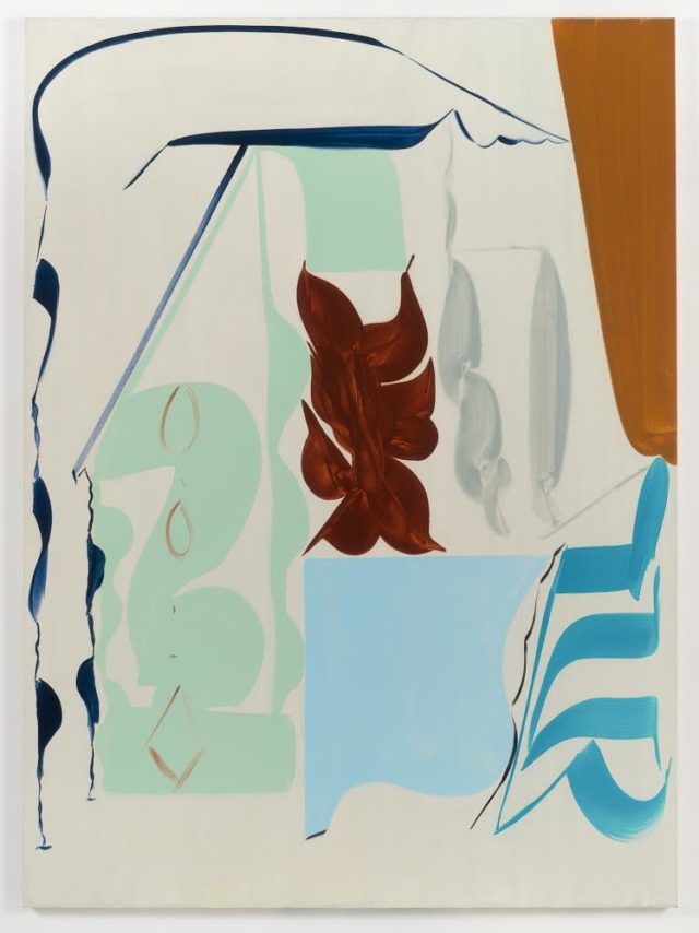
Patricia Treib, “La Roda,” oil on canvas, 2017. 75 x 55 inches. Image courtesy Bureau and the artist.
It’s funny you should mention that press release and Treib’s “language”. Before we even saw this show, I’d been thinking a lot about how reliant on language abstract painting has always been. I wonder if Treib’s work is part of a mini-zeitgeist of painters working through that problem on some level? I’m thinking of the text-like qualities of Al Peters’ current show at The Painting Center—described with that overused phrase “non-objective painting”—and to a lesser extent RM Vaughan’s controversial review of Amy Feldman.
It seems Treib and these other painters are using forms that play with the idea of the glyph or allusions to alphabets—Feldman less successfully, granted. We saw Interstices with Sophia Park, who remarked “these remind me of illuminated manuscripts with all the letters removed”. Some areas struck me as fragments of Hebrew letters or Arabic and Western calligraphy. In an era where terrible, terrible text-based work is ubiquitous at art fairs, perhaps we like making/seeing shapes reminiscent of language without the presence of an obnoxious imperative phrase? We’re so programmed to read and think in text constantly, but (presently) so unaccustomed to enjoying it’s content.
Patti: Honestly, I’m conflicted about painting in general. It has never really interested me beyond its formal qualities. I usually see it as a 2D design object that’s easier to sell than performance, sculpture, or video—something to coordinate with your home or office decor. As a curator, though, I’m drawn to paintings in group shows when they can dialogue with other media: providing tension, historical context, or existing as one aspect of an artist’s larger practice. Ulrike Müller’s work is a great example of that: incorporating performance, queer/feminist publishing, and textiles.
Treib’s apparent interest here is only painting about painting, fitting snuggly in a canvas. She does falls into the mini-zeitgeist you are talking about, though. If I was a collector of White American women painters I would buy one.
Michael: Ha! If I could afford to be a collector of anyone, I would too. I’m a big painting fan though.
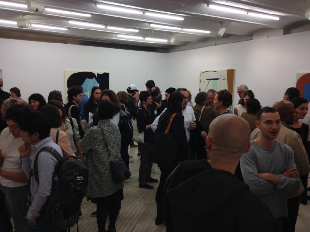
Opening night.
Patti: To be fair, seeing this during the opening probably reinforced my association of this work with decor. Like you said, there were so many people that the artwork became just a backdrop to a social gathering. My first impulse was to be completely dismissive, yet in retrospect I was taken by the formal qualities: the size of the canvases, color choice, the way the shapes relate to each other, the brush strokes. Her mark-making is bold and calming at the same time.
Michael: Ha! If Patti Hernandez admits to kinda liking a painter, they must be doing something right!

Comments on this entry are closed.