
Frieze entrance
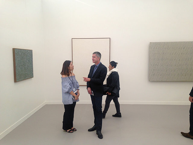
Yesterday we discussed the overall look and feel of Frieze and concluded that this iteration of the fair is far superior to previous years. Lots of lively inventive work and short on the kind of soulless work in a frame that can make these events so tedious. Today we take a deep dive into a lot of the art we saw. Let’s get down to the nitty gritty.
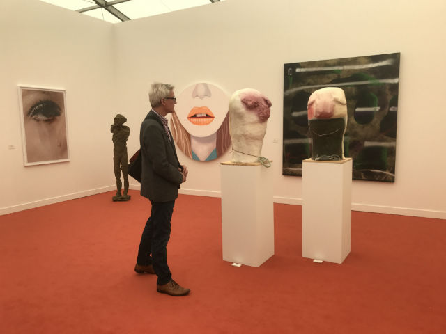
Anton Kern, Installation view.
Paddy: A good showing from Anton Kern Gallery. The lighthearted Nicole Eisenman statue heads with peace necklaces look like simplified characters derived from the Simpsons or some other cartoon. Their jovial spirit makes me happy. Meanwhile, the Anne Collier photograph to the left pictures a woman’s eye and a lone tear on her cheek. I felt uncomfortable viewing this work—like I was staring at a stranger crying on the subway platform. Collier has a talent with eyes—in another photograph (not on view) she showed a photographic reproduction of an eye being put through a paper cutter. It was hard to look at that work too, which I think is the point.
Michael: I didn’t realize these sculptures were Nicole Eisenman until you pointed them out to me! I had no idea she made 3D work, and I actually think they’re better than many of her paintings, which may have fallen into a bit of a rut on account of how prolific she is. At times some can feel a little formulaic to me, like her mark making and form language become muddled by a desire to read as both illustration-like and painterly. Sometimes the result is a painting that feels like dated graphic design. The sculptures don’t have that problem. It’s funny how often that happens with painters—I almost always think they make the best sculptors.
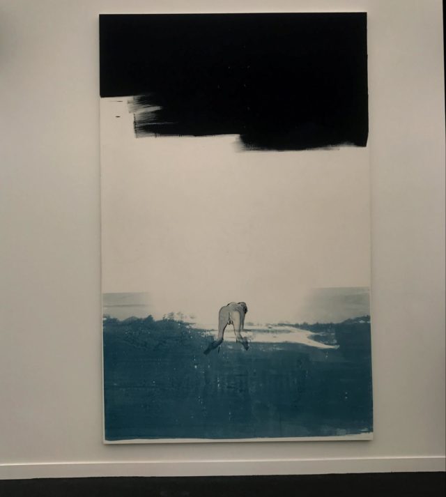
Tala Madani, “The Emblem,” Oil on linen, 2017.
Don’t get me wrong: There’s plenty of painterly, illustration-like 2D work I like. And this year, Frieze had a plethora of examples. Yesterday, I mentioned that Tala Madani painting at David Kordansky Gallery of the naked man crawling away from the viewer. There’s something so fluid yet awkwardly descriptive about the way the figure is rendered with an economy of wet strokes, utterly other from the alien “landscape” he’s crawling across—which is dry brushed and looks like silkscreen ink. There’s a logic to the difference in textures between the organic and inorganic that’s so simple yet rewarding.
Paddy: I also thought there was a good showing of sculptural paintings. For example, there were a bunch of small Llyn Foulkes paintings at Spruth Magers that resemble those on view at the New Museum a couple years ago that stand out. Most of these are the repurposed second hand store paintings he collages and builds up their surface, but there was also a Mickey Mouse painting. Foulkes sees Disney as the root of all evil, so sometimes the political message of work veers into dopiness, but the sheer technical virtuosity of these works gives them a faux-naive feel. In other words, the simplistic message seems important to understanding the paintings.
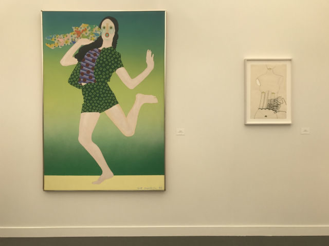
Left: Kiki Kogelnik, “Express”, 1972, oil and acrylic on canvas. Right: Kiki Kogelnik, “Untitled (Still life with hand), 1964, enamel and india ink on paper. Simone Subal Gallery.
Paddy: This booth of Kiki Kogelnik paintings falls into the trend of wacky figuration we identified yesterday in part one of our post. Kogelnik is considered to be Austrian’s most important pop artist, though like many pop-artists, she sometimes disputed the label.
The majority of the works in this booth come from her “Women” series, which pictured women as they were portrayed in commercial advertising. Knowing this made me wonder if the current trend of figuration might be informed by similar interests. Millennials are likely to be influenced by Instagram and Facebook, but the end result is similar—pictures of people looking happy.
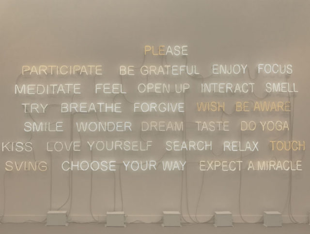
Jeppe Hein, “Please Participate”, 2015, Neon Tubes, transformers, 303 Gallery
Michael: I don’t think I have ever had such a visceral immediate reaction of hatred to an artwork as this one. Is this like a parody of bad inspirational meme decor? What the hell is “SVING” and why do I need to do it after yoga?
Paddy: It’s so bad. This work was centered in the vortex of bad text art at the back of the fair and at some point, I think both of us had ended up walking in circles trying to figure out how to escape the area. It needs to be quarantined for the protection of fair visitors.
The best Jeppe Hein works I’ve seen take a jab at the “white cube” while simultaneously evoking the universal. Olafur Eliasson and Dan Graham are often cited in reference to Hein, and when his works fail, typically it’s because they are retreading well worn territory of 70’s art making. This cringe-worthy work fails in the same way an Eliasson might fail—striving for a universal by offering up prescriptive verbs associated with being content and self-aware. The problem, of course, is that it removes all the day to day bullshit that all this self-care is meant to deal with. It’s so simplistic a message it’s offensive.
Michael: This is what I imagine would hang over the reclaimed wood counter at the gluten-free macaron bakery that opens to signify a neighborhood has gentrified to the point of being uninhabitable to all but the least self-aware.
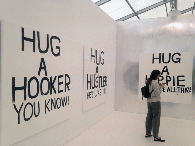
Karl Holmqvist “untitled” at Gavin Brown’s Enterprise
Michael: Gavin Brown’s Enterprise’s blindingly-bright booth is a bit of a head scratcher. It’s dominated by these massive Karl Holmqvist marker paintings with phrases like “HUG A HIPPIE; IT’S ALL THAT” and “HUG A HOE; HE’LL LIKE IT!” I’m not sure what to make of this and I am not sure anyone else did either—including the gallery staff, who at times seemed almost embarrassed by the booth?
Paddy: This is reminding me how little of the text art on view succeeded. Are these paintings supposed to thwart identity stereotypes and preach a message of acceptance? I assume these paintings are made with marker as a gesture to the protest signs we’re all spending our weekends making now. Fair enough, but they don’t translate well to an art fair environment. Protest signs are democratic by nature—these are just vessels for the uber rich to park their money.
Michael: It’s a shame these dwarfed Verne Dawson’s recent series of small oil paintings. Each of them is a bleak scene of low income quasi-rural-quasi-suburban sprawl. At first glance they seem to reference pastoral romantic landscape painting. Then it becomes apparent that all is not right: there’s a subtly acerbic clash of colors, the brushstrokes feel violent and unresolved, and the landscape is marred by highways and hastily-painted trailers. They’re a little hard to look at despite the fact that they’re great paintings. They feel very of this era—I think they reflect the unease (guilt? horror? sociological curiosity? alienation?) with which “our America” has been forced to look at “other America” since the election.
Paddy: While I agree this booth is a head scratcher, I actually think those Dawson paintings held their own against the Holmqvist—no small feat considering the difference in scale. (Dawson’s paintings were no more than 18 inches wide while Holmqvist had an entire installation.) We both drew a lot of out of those Dawson works—but the other works in the booth, a series of crude renderings of Japanese homes received virtually no attention from us. I had to look up the photos to remember what they looked like, I have no image of the label and can’t find them anywhere else online. Those were the works that were forgettable—as is evidenced by the fact that we forgot them.
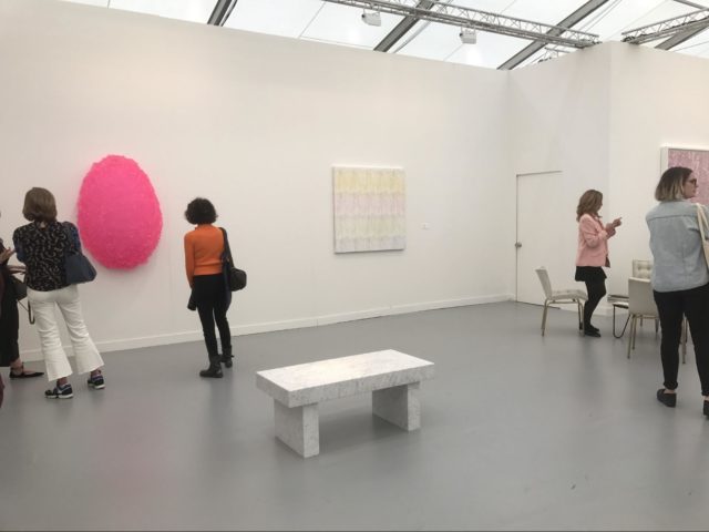
Cheim & Read, “Pink”, installation view.
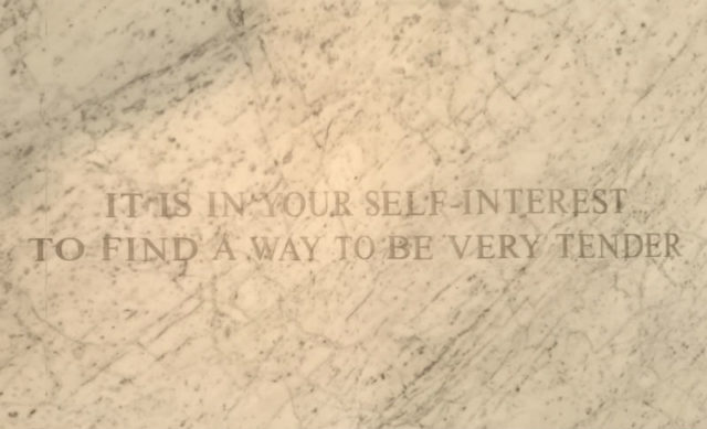
Jenny Holzer, Truism on a marble bench
Paddy: In honor of the Women’s March and the sea of pink hats, Cheim & Read put together a booth of works defined by the color. I support the impulse here, but the result is a clear miss. For one, at first glance, the booth looks like a boutique outfitted for spring. Very little in this booth looks like it’s worth the money they’re charging for it. For another, the text based works they had available—all by Jenny Holzer—either suffer from sentimentality or were simply too aggressively weird for viewers to feel anything but awkward. (I’m speaking specifically here of Holtzer’s tattoos, which contained messages like “I find her squatting on her heels and this opens her so I get her from below” paired with “I have the blood jelly”.) I overheard a sales consultant hilariously straining to spin Holtzer’s truism on a bench positively. “This one— “It is in your self interest to find a way to be very tender”—[pause] is a more uplifting message.” She smiled awkwardly.
Michael: So many of the Holzer tattoos left even me (notoriously immune to the gross-out) feeling icky. There’s lots of references to sex acts with questionable levels of consent, predatory stalking, menstrual shame, violence, and death… these deserved a much more seriously curated booth of feminist work beyond the “everything is like, totally millennial pink!” theme here. Of course, Louise Bourgeois’s fleshy bas relief of giant nipples was the booth’s stand-out highlight. Hung at head-level, they suggest the adult viewer could just open wide and get a squirt of breast milk, which is both funny and disgusting. Cheim & Reid missed a curatorial opportunity here. Starting with Holzer’s tattoo pieces and the Bourgeois, they could have seized on the body horror aspect of Trump (“Grab em by the pussy,” etc…) and run with that as a curatorial thread rather than fuzzy pink hats. This is actually an almost offensively reductivist approach to contextualizing feminist art.
Paddy: I totally agree with you. The whole point of this booth is to activate people against the misogyny of the Trump administration. Pink isn’t a concept—it’s a color. It’s unsurprising then that most of the work felt neutered.
(Left to Right) Ha Chong-Hyun, “Conjunction 01-2-8,” oil on hemp cloth, 2001; Chung Sang-Hwa, “Untitled 88-7-28,” acrylic on canvas 1988; and Park Seo-Bo, “Ecriture No. 68-78-79-81,” pencil and oil on hemp cloth, 1968.
Michael: At the other end of the color spectrum (or rather, off it), New York’s Tina Kim Gallery teamed up with Seoul’s Kukje Gallery to present a booth heavy with the big names of Dansaekhwa (a movement of monochromatic abstraction that arose in postwar Korea). I’m fascinated by Dansaekhwa for a few reasons. The use of cheap materials, emphasis on non-objective “labor,” and resistance to “beauty” makes the work feel like a bit of a sneaky protest against South Korea’s brutal 1970s dictatorship. I love the idea of seemingly inoffensive abstraction as a subtle rebellion against authoritarianism (how very different from Ray Bradbury’s vision of the art world in Fahrenheit 451!). The genre’s prisoner-number-like titles and dreary palette contribute to the dystopic vibe.
Ha Chong-Hyun, “Conjunction 15-150,” oil on hemp cloth, 2015 and “Conjuction 14-135,” oil on hemp cloth, 2014.
And seemingly, the art market loves Dansaekhwa too (there have been countless retrospectives on the movement at commercial galleries in recent years). It makes sense: everyone wants an excuse to frame collector-friendly abstraction with a good guilt-free backstory, particularly if it exists just outside the Western art history canon. I was a little taken aback by how many of the Ha Chong-Hyun works were from the 21st Century (I’m sure his older work’s been snapped up by collectors by now) and how it didn’t feel at all out of place with his peers’ work from decades ago. I like the idea that these artists (now quite elderly) have kept up this somber practice for longer than I’ve been alive and now they’re finally getting recognition (and seriously big paychecks) outside of a small-ish Seoul scene.
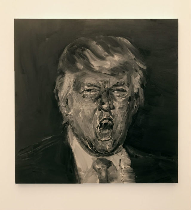
Yan Pei-Ming, “President-elect Trump,” 2017. At Galerie Thaddaeus Ropac
Michael: Speaking of anti-authoritarian impasto monochrome paintings, pussy-grabbing, body horror, and protest booths, I feel we’d be remiss if we didn’t mention Yan Pei-Ming’s horrifying portrait of Trump (one of the few on-the-nose political works we liked). This is America, directed by David Cronenberg.
Paddy: We can’t escape Trump—not even on an island art fair for the rich.
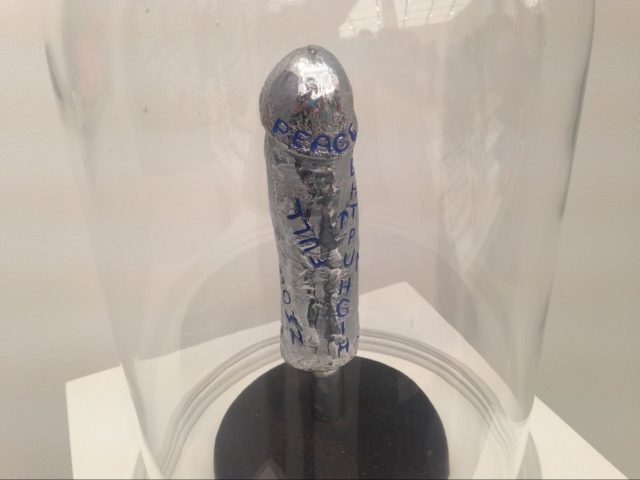
Gerd Stern, “Hard On for Peace,” 1963 at Carl Solway Gallery.
Michael: Actually, this is my favorite political work. In the Spotlight section of solo booths, Carl Solway Gallery had a really nice Gerd Stern retrospective with this “Hard On for Peace” slightly tucked away in a corner. I laughed out loud when I saw this, because it’s such a direct way of messaging desire—even for a goal as noble as the anti-war movement.
When one of the people working the booth noticed me taking a picture, he remarked “Pretty impressive, eh?” and seemed to imply that the sculpture was a cast of the artist’s actual erection, gesturing across the booth towards the real, live, in-the-flesh Gerd Stern. The artist, for his part, just shrugged “What can I say? I was a younger man in the 1960s!”

Comments on this entry are closed.