

A view of the Giardini. Photo: Marsha Owett
Pretty much any traveler will end up thinking about time in Venice given the age of the city, but the Biennale amplifies this tendency. Even in thinly attended years, visitors to the Venice Biennale preview quickly get used to standing in long cues to see popular pavilions. As far as VIP events go, the pavilion previews aren’t the least bit exclusive, so wait times come with the territory. As a result art is often considered by whether or not it’s worth the time you budget.
Usually, though, there’s at least some pay-off for spending time in a line. (This didn’t prove true for the Biennale show.) This year, I probably spent the most time waiting to get into Anne Imhof’s four hour long opera “Faust” at the German Pavilion (and Golden Lion winner for Best Pavilion)—about an hour—which meant I caught about an hour inside the pavilion. That’s less time than I wanted, but given that there were two caged Doberman Pinschers outside the pavilion and performers who occasionally came out, the wait time was clearly intended to be part of the experience. Two out of four hours doesn’t seem that bad for a performance that’s not intended to be seen from start to finish.
The dogs were a dramatic touch and certainly primed the audience for a performance largely about power. They are, after all, a trophy dog meant to display power and aggression. At one point, a performer perched herself at the top of the 14 foot cage, adding to the spectacle. Yet spectacle—of which there was plenty—is different than the grandeur typically associated with operas. There is no grandeur here. The performers wore dour expressions and weathered black athletic gear. Inside, a raised floor made of glass creates an underworld for the performers, but is otherwise bare except for an array of cell phones, chargers and other personal electronics. No part of the set or costuming seems large or flashy.
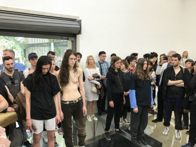
The final act in “Faust”. Photo: Paddy Johnson
I wondered if some of these decisions were a reflection of a culture that has become inured to the effects of scale and ostentation, but for Americans, at least, that can’t be true. We elected Donald Trump. A better explanation might simply be that the health goth aesthetic furthered the idea that sensitivity and vulnerability does not preclude the possibility of toughness and anger.
Certainly, the performance itself reinforced this idea—at one point, from the vantage point of the floor, I watched a woman underneath me sing while lying on her back. She sang with her fist to her mouth, onto which she had affixed a small microphone with medical tape. At times her fist would begin to shake, though I was unsure if this was an expression of fortitude or fragility.
Just as often, the piece felt oddly church-like, as though we were watching a kind of ritualized endurance project. (Jennifer Lacey, Antonija Livingstone, Dominique Pétrin and Stephen Thompson’s “Culture Administration & Trembling” performed at the Abrons Art Center last year had similar qualities). In some instances, performers stood on ledges high above the audience (at one point, I’m told they danced with a dead chicken and splayed it against the plexiglass ledge.) In others, performers scurried under the transparent floor and through semi transparent glass, transforming their bodies into a ghost-like presence against the clear reflection of visitors.
After the performance had ended I returned to the stage, though now there were only a few visitors in the pavilion. Walking over the set—which without the visitors to cover the floor was completely transparent—I was overcome with vertigo. I might have been walking over glass, but it looked like I was walking on air, and I started to feel nauseous. Mostly, this is due to my own fear of injury and death. But on another level, I couldn’t help but think that ritualistic quality of the piece demanded an audience—feeling disorientingly empty without one. It was one more reason “Faust” felt like going to church. Church, with black lipstick.
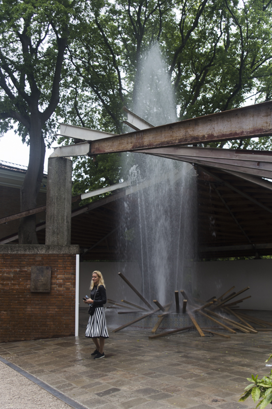
Geoffrey Farmer’s “A Way out of the Mirror”. Photo Marsha Owett
Exiting the German Pavilion leads one directly to the Canadian Pavilion, which had no lines whatsoever. That’s not necessarily an indication of the quality of the work, though in this case the two happened to align.
As it happens, there was also no pavilion to speak of—Canada is renovating its exhibition space. To kick off the project, artist Geoffrey Farmer disassembled the bulk of the building leaving only a few support beams and installing a fountain that squirted water a several feet into the air. Farmer carefully placed large pieces of lumber around and inside fountain, as well as a grandfather clock nearby. I was a bit confused about why a viewer should care about the show—the Brooklyn Museum’s water fountains are far more impressive and nobody bothered to call them art. The press release didn’t help. It talks about two images that informed the piece, which is titled “A Way Out of the Mirror”. One was his grandfather’s lumber truck after it had been hit by a train. The other was Hieronymus Bosch’s “The Garden of Earthly Delights”, a picture that reminds Farmer of a fountain at the San Francisco Art Institute, which was important to him because it was the city he came out in during the Gulf War and AIDS crisis.
Now, that’s a whole lot of personal history, and sadly none of it amounts to anything visual worth contemplating. It’s a bit of a downer after coming off such a high at the German pavilion.
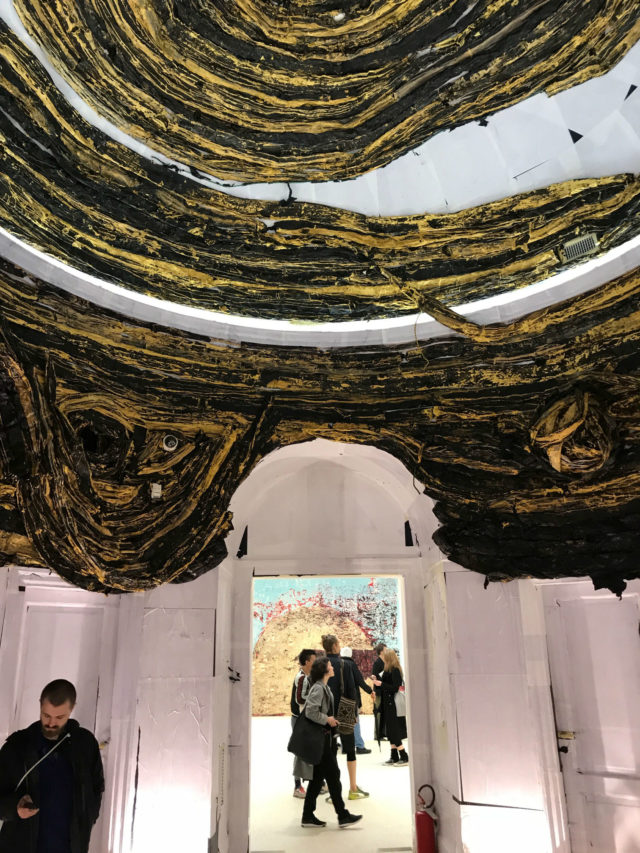
United States Pavilion. Mark Bradford, “The Oracle”.
Thankfully there were other highs, though they did include waiting in line. Most notably, the wait to see the US pavilion this year proved worth the effort. Mark Bradford used abstract painting as an architectural intervention, literally transforming the building for this installation “Tomorrow is Another Day”. Visitors enter through a side door, meant to allude to a servant’s entrance. A thick black sculpture with mutable tarry skin hangs from the ceiling, leaving only a small passageway. This forces visitors to the outer wall of the pavilion, which I read as an allusion to those marginalized in society. It works.
Bradford similarly transformed the center rotunda, papering the walls white and then covering the ceiling further with strips of thick black and yellow paint. The materials make the rotunda look as though it’s been taken over by a strange sickly growth‚—the paper a flaking skin and the paint a strange and odious growth. The reasons for this growth are unknown, but it’s hard not to interpret the piece as a reflection of our deteriorating institutions. The architecture is crumbling and there are no stewards in sight.
The rotunda leads into abstract paintings that have lighter palette and open up compositionally. Bradford made the paintings without the use of brushes—he built up the surface with layers of paint and then removed them with an electric sander. While visually stunning, for me, these felt a bit forced. Spheres dominate over all other motives and webs of paint coated the surfaces, at times resembling a bad sci-fi wallpaper.
They did however sufficiently lighten the mood for the final room of the pavilion, where a short loop of Bradford’s former neighbor, Melvin, plays. The video consists only of footage of Melvin swinging his hips gently as he walks away from the camera and down a street in the slums of South Central. The piece is titled “Niagara” a reference to the final scene in the Marilyn Monroe movie of the same name where she similarly saunters off into the distance.
When I first saw the video, it struck me as rather sad. Melvin was forever stuck in that loop and in those slums. The piece was executed in 2005—where was he now? After a while, though, I stopped asking that question and became enraptured with the swing of his walk—a sly act of of both resistance and pleasure.
Elsewhere in the exhibition, I hadn’t found much hope, but within the context of this video, a lot of the work seemed to be setting the stage for what comes next. And I was looking for that, in no small part because I spent my time in line for the show reading the extra-textual material about Art + Practice, a non-profit founded by Mark Bradford. Through Process Collettivo, they partnered with Rio Tera dei Pensieri in Venice to work with incarcerated people and to support their transition to self-sufficiency.
It’s a great project and reflects the narrative told by these paintings and videos. We’ve got a lot of work to do to build back our institutions, but further corrosion isn’t inevitable. It made me optimistic about the future.
And it got me thinking about time again. Whereas Bradford looked ahead to find strength, and Imhof’s opera reflects the anxiety of the moment, Farmer’s fountain was so situated in references to the past that it became unintelligible. That’s a common problem in contemporary art—building upon past references without having much to say—but perhaps its failures also a reflect our current needs. For better or for worse, we’ve changed too much for the voices of the past to guide us into the future. For this reason, the most relevant art I see reflects today’s uncertainty, while casting its gaze to whatever comes next.

Comments on this entry are closed.
{ 1 trackback }