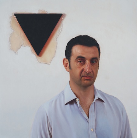
Matthew Watson, "N.G. and J.K," 2012 Oil on copper 14 x 14 inches. (Image courtesy of Joe Sheftel)
Joe Sheftel, 24 Orchard Street
(Through 2/24) Matthew Watson, Commission I Barter I For Sale
What’s on view: Realist portraits of collectors, artists, and dealers with their art collection
Corinna Kirsch: Matthew Watson’s a recent Columbia MFA, so I bet making portraits of insiders is a good way to start a money-filled career?
Whitney Kimball: Watson’s clearly passionate about realism, and it feels like he’s trying to cover it up by relating this to the art world. (They’re basically just banal website headshots.) It sucks the life out of it. This show just made me think it’s too bad that realist painters tend to come up with a conceptual alibi to be in the art world, which you don’t. If the same investment went into the initial image, these could be great.
Corinna: Yeah, I get that. The work that comes closest to being interesting enough on its own would have to be C.H. and D.G., just because I felt like the woman and the cat in the painting were staring me down. Weird cat plus red-splotchy arm equals stranger than life.
Paddy Johnson: By description, the show sounds terrible, but the more I think about it, the more I like it. For starters, I think there’s an appropriateness in making paintings of people with their art. When you learn they’re art worlders, that only adds to the work; they’re like commissions of wealthy folk with their dogs. It’s what we like.
Also, for all their stiffness, it has to be said that the paintings are surprisingly good. They benefit from their awkwardness; J.S and A.D.C. is terribly lifeless, but the peeling wall behind the sitter, is a pleasure to look at. In N.G. and N.K., the triangle artwork matches the sitter’s head below. It’s really just pleasing to look at.
There’s a lot more of these kinds of delights in this show than I ever would have expected.
Stephan Stoyanov, 29 Orchard Street
(Through 2/17) Renata Poljak: Uncertain Memories
What’s on view: Yugoslavia as depicted through film, TV, interviews, and memorials
Whitney: Similar to the collecting approach of the New Art Practice in Yugoslavia in the 60s and 70s, Renata Poljak combines a broad scope of images from the media to reflect culture. Her videos talk about how actors end up representing and idealizing culture for us. There’s a tour guide at the Holocaust Memorial, an underwater video of a tongue licking a foot, a clip from the communist propaganda film Bosko Buha (1978) (above), and an interview with the now-adult actor who played the child soldier in that film.
It would be nice if this weren’t so loose. Americans are unlikely to piece together the ideas without spending at least a half hour here, and not everything adds to the show (the photos, particularly). But those that do end up feeling very poetic; next to all the death, that video of a huge rubber tongue, just nudging a girl’s foot in a pool, feels extremely sad.
Corinna: It’s truly a skill to make someone feel sad after watching a tongue pushing a foot.
Now, from the several minutes I spent watching the videos, I’m pretty sure I liked them. Of course, it’s hard not to like a fairly straightforward documentary—nobody goes running around hating on Netflix’s top-rated documentaries for the sake of their form. I’m reminded of Phil Collins’ film Marxism Today (Prologue) 2010, which follows the lives of Berliners after the fall of Communism, but Collins’ film is far more stylized. Maybe that’s one element missing from Poljak’s seemingly straightforward approach, which’d make it a bit more memorable?
I did appreciate seeing media clips from the 1990s of Ivan Kojundzic, the child actor from Staging Actors/Staging Beliefs; after his fame dimmed, he fought in the Croatian War of Independence, and after that he strove on in a new, heroic role as a newscaster. In the video, he reports on war, crime, and even that international controversy of Evander Holyfield’s win over the practically undefeated Mike Tyson. Still, I couldn’t glean most of that amusing backstory from the videos alone (Stephan Stoyanov was in the gallery), and that’s not a good thing.
UNTITLED, 30 Orchard Street
(Through 2/24) Anna Plesset
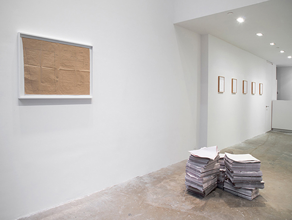
What’s on view: Maps, trompe oile xeroxed sheets, paintings, sculptures, and library books focused on the forgotten Impressionist painter Lilla Cabot Perry
Paddy: [First impression] I don’t get it. A series of framed xeroxed pages from a book about Impressionist painter Lilla Cabot Perry lead you into the show. Then there’s a sparsely arranged assortment of paintings that seem a little too considered to be interesting. A couple of blank surfaces displaying what must be a painter’s source image; there’s red paint all over the photograph of flowers. There’s also a white-on-white painting of light from a window, two sawhorses, one with more materials and a book called American Art, and a couple of pedestals/towers made by a combination of piled painted boards and affixed book covers.
What is this? It feels like an abstraction of a painter’s studio I’ve been given no reason to care about. There seems to be an unspoken assumption here that the viewer would have just as much interest in art making as the artist, and that’s almost never the case (particularly here).
Commentor Benbenbot: pretty much everything in the Anna Plesset show was drawn or painted by hand. The ‘xeroxed’ pages were drawings, the ‘affixed book covers’ and ‘photograph of a flower’ were paintings.
Paddy: I’m not convinced knowing this improves the work at all, but the opaque press release at least makes more sense. What good is a “fiction” if the story isn’t in any way compelling?
Corinna: I don’t care if your work falls under the blanket term “conceptual”, it’s not an excuse to make an uninteresting show. From the standpoint of exhibition design, the front room consists of diagrams and xeroxed sheets and all of the objects have been hidden away in the back gallery. Just throw me a bone.


{ 4 comments }
Ummm…. pretty much everything in the Anna Plesset show was drawn or painted by hand. The ‘xeroxed’ pages were drawings, the ‘affixed book covers’ and ‘photograph of a flower’ were paintings.
Oh hey thanks for this. I didn’t remember that from our visit. I added your comment to the piece and responded to it.
The Matthew Watson paintings bring to mind the fictional painter Jed Martin’s portraits of art world insiders (e.g. “Jeff Koons and Damien Hirst Discuss the Art Market”) in Michel Houellebecq’s The Map and the Territory. I suppose it all could be a simply mercenary tactic on Watson’s part, but I think the paintings’ initialed titles play with the social games and name-checking that sometimes takes precedence over the actual art, which is doubly true for photorealism, because it so often is derided as “facile.”
Egg Plesset
Comments on this entry are closed.