
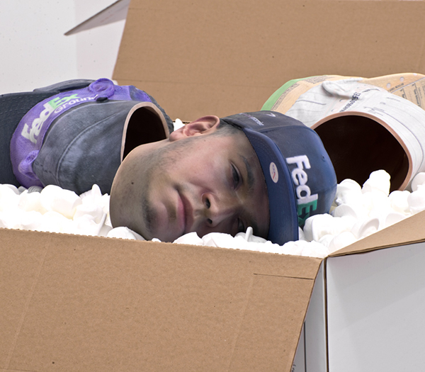
Josh Kline’s unsettling “No Sick Days.” Image courtesy of UNTITLED.
Not much connects the Lower East Side’s current crop of summer shows, except maybe for a shared inclination towards some (much-needed) weirdness. 47 Canal brings a seaweed-covered TV to DTR, while those looking for their fix of visual hallucinogenics should head to Lisa Cooley’s Eric’s Trip. UNTITLED’s The Husk, meanwhile, has the creepiest thing you’ll see all summer in the form of Josh Kline’s disembodied FedEx worker heads.
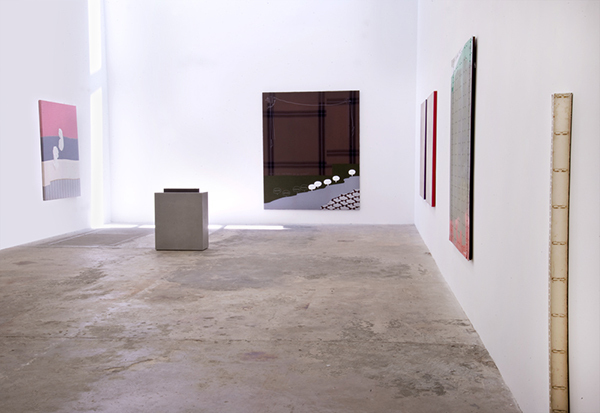
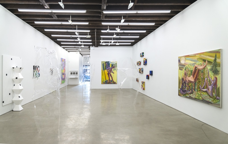
Installation view of The Husk. Image courtesy of UNTITLED.
UNTITLED
The Husk: Kathryn Andrews, Cosima Von Bonin, Eric Davis, Josh Kline, Mark Leckey, Cameron Rowland, and Gedi Sibony
30 Orchard Street, New York
Runs through August 2, 2014
A trip to this group show at UNTITLED is worth it alone for Josh Kline’s sculptures, which were among the better things I saw in the Lower East Side. In his three sculptures, all titled “No Sick Days,” 3D-printed body parts (a FedEx worker’s head, hands holding a cellphone) sit atop beds of packing peanuts in freshly opened FedEx boxes. The body parts—some of which have been colored realistically, while others have been layered with images of the FedEx website—are nightmarish. With the heads laying on their sides and peering out with glazed-over, lifeless eyes, these pieces are incredibly creepy. All of the heads and limbs have been hollowed out, and Kline has left holes so you can peer into their dark, cavernous spaces. Disturbing as they are, the pieces form a somber meditation on the exploitation of worker’s bodies.
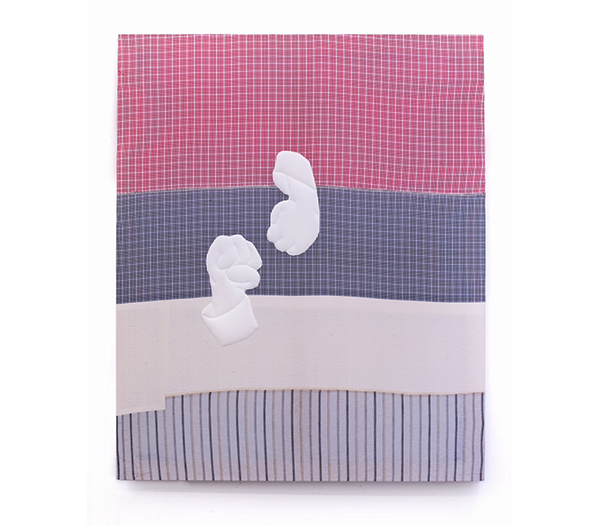
Cosima Von Bonin’s “36 BUBBLES LOOP #07.” Image courtesy of UNTITLED.
Cosima Von Bonin’s cotton and wool “paintings” seem to mirror “No Sick Days’” interest in labor and workers’ bodies, albeit with less high-tech materials. In “36 BUBBLES LOOP #07,” two white fists float on top of stitched together fabric. The fabric, patterned in simple stripes and plaid, has a domestic quality to it, and feels a bit like re-purposed sheets. The fists are clenched in a way that suggests protest, but against the fabric, they feel limp and dead—not unlike Kline’s chopped-up FedEx worker. Together, these two works end up providing some emotional depth to a show that’s otherwise heavy on cold abstraction.

Installation view of 47 Canal’s DTR. Image courtesy of 47 Canal.
47 Canal
BFFA3AE (Daniel Chew and Micaela Durand): DTR
47 Canal, 2nd Floor
Runs through August 2, 2014
47 Canal presents their first show of net-art collective BFFA3AE (Daniel Chew and Micaela Durand), who were just recently featured in MoMA PS1’s group exhibition Taster’s Choice. While the collective has previously worked mainly in video and performance, this show includes both collaborative installations and individual sculptural pieces by the two members. For better or worse, the work fits right in with 47 Canal’s stable of artists (Josh Kline, Ajay Kurian, and Anicka Yi); like those artists, BFFA3AE manipulates and combines generic products (like mylar balloons with Disney Characters, soap dispensers, and seaweed snack packs) in witty, slightly ironic ways. At best, the work makes you rethink your relationship to the mass-produced objects that infiltrate our lives; at worst, it becomes pun-filled one-liners.
The best piece in this show is one of the first you encounter: a TV propped flat against the ground, its screen covered in seaweed rectangles (the sort that you buy in snack packs at a grocery store). I think part of why this piece worked was how, although, seaweed and television screens couldn’t feel farther apart from each other, there was an oddly convincing formal parallel in the way that the smaller rectangles of the seaweed mimicked the larger black rectangle of the television screen.
BFFA3AE’s “Untitled.” Image courtesy of 47 Canal.
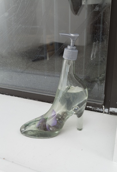
That same inventiveness was missing from the show’s other pieces. In the center of the room is a small, tight corridor filled with slowly deflating helium balloons—the kinds that you would buy at Party City. The installation felt a bit like a clichéd metaphor about the inevitable loss of childhood innocence. I wouldn’t be surprised if BFFA3AE intended the cliché, and were being tongue-in-cheek about the whole thing, but that would just make the piece an empty joke. Likewise, a soap dispenser that’s shaped like a high-heel shoe doesn’t go much beyond a kitsch display of an outrageous found object, like something you might find in a thrift store. Found objects are elsewhere in this show, like a giant piece of found vinyl that hangs from the ceiling; BFFA3AE has a clear interest in the found object. But what the collective does with these objects doesn’t have any bite to it. It’s fun to look at, but I’m not sure it’s doing much more than that.
Installation view of Lisa Cooley’s “Eric’s Trip.” Image courtesy of Lisa Cooley.
Lisa Cooley
Eric’s Trip
Curated by Cynthia Daignault and Mark Loiacono
107 Norfolk Street, New York
Runs through August 1, 2014
The title of Lisa Cooley’s group show, Eric’s Trip, takes its name from a scene in Warhol’s Chelsea Girls where the character Eric takes LSD and narrates his “trip.” (It’s also the title of a Sonic Youth song.) The gallery, accordingly, is filled with hyper-colorful, neon eye-candy–mostly painting, but a few sculptural works and a backroom video installation. From José Lerma’s brightly painted flowers to Matthew Zefeldt’s mashups of greek busts and rainbow colorscapes, this show is heavy on visual stimuli.
But “hallucinogenics equals vibrant colors” is a pretty standard cultural trope. And while the press release might claim that these works “negotiate the discrepancy between hallucinatory fantasy and fixed reality,” many of these paintings feel like little more than day-glo attention-grabbers. I’m not sure that artists are becoming more interested in altered-consciousness than they are resorting to neon psychedelics in attempts to get people to notice their works.
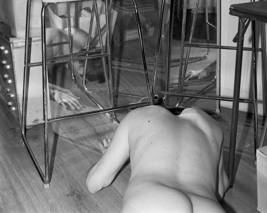
Rory Mulligan’s “Floor.” Image courtesy of Lisa Cooley.
Where this show starts to get radical is in its grayscale works; we don’t normally associate black-and-white with LSD, but the few works included in the show prove that a limited color palette can speak more to altered states of consciousness than hyper colors. That’s especially true of Rory Mulligan’s two small photographs. In one image, a nude male lies face down, surrounded by metal furniture legs and interlocking mirrors. The space reads as domestic, but is otherwise nonsensical and disorienting. The chairs are placed claustrophobically close, the mirrors confuse more than they reveal, and we’re given little clue as to why the naked male has ended up on the ground. Black-and-white photography can sometimes come off as nostalgic, but Mulligan makes it feel hyperreal.
If Eric’s Trip is meant to focus around states of altered consciousness, then Mulligan’s work is some of the most successful at doing that, all the while being some of the most unassuming work in the show.

Comments on this entry are closed.