
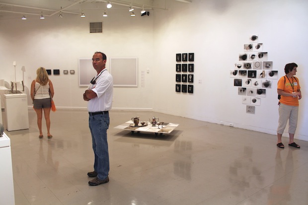
Install shot, and suspect gentleman, at the Sondheim Semi-Finalist Exhibition
The Sondheim Prize is a pretty great deal; it awards $25,000 to an artist living in the Baltimore area, and $2,500 to each artist selected to participate in the finalist exhibition. Earlier this week, we discussed the Finalist show, which we found generally underwhelming; we found more soul and newness in the much larger pool of artists in the Sondheim Semi-Finalist Exhibition. We discuss the show with Baltimore City Paper’s art critic (and our Baltimore host for the weekend) Michael Farley, who recently published “Why Prizes Matter”: an argument for why more people need to apply for the Sondheim Prize. We agree with him.
The Sondheim Prize Semi-Finalist Exhibition
Maryland Institute College of Art
Runs through August 3, 2014
What’s on view: Work by 38 semi-finalists for the Sondheim Prize, held inside several galleries at MICA. You’ll find dozens and dozens of sculptures, photographs, video, and drawing that made the shortlist for the Sondheim Prize, an annual open-call juried exhibition of work from Baltimore-area artists. As this was a finalist show, without a curatorial theme per se, the show has the feel of walking into 38 separate studios; you’ll find tree branches held together with twine on a pedestal (Chad Tyler’s “Forest Follies), precisely painted works of dinosaurs, a bouncy castle, and a human-size fried chicken leg (Nora Sturges), or the rusted remains of a 1971 Chrysler Newport (Benjamin Kelley).
Michael: It’s funny that the Sondheim Finalist show felt over-curated, because I think this year’s Semi-Finalist show benefited from some really great curatorial strategies. It’s no easy task to wrangle 38 artists into a cohesive exhibition, but I think Kim Domanski (Public Arts Coordinator for the Baltimore Office of Promotion and the Arts) struck a really nice balance between the individual artworks and suggesting dialogues. There’s always this really weird disconnect between the outdoor spectacle of Artscape and the interior exhibitions.
Two of my favorite moments in the Semi-Finalist show are anchored by references to Baltimore’s streetscape— sort of bringing elements of the city outside into the gallery. Dustin Carlson’s police barricade and lighting rig are so quintessentially Baltimore (the police department puts these awful mobile stadium spotlights up on “problem” corners) but are stripped of just enough detail to give them a kind of non-specificity that’s really interesting to me. They’re familiar, but in the way you might remember something from a dream. They almost remind me of Tom Sachs, but Sachs’s work is all about making pop culture personal. Carlson’s work makes the familiar somehow more generic, or more universal.They’re also impressive from the point of view of scale—Carlson apparently had to lop the top of the lighting rig off to fit it in the gallery. I loved seeing the lights next to Trevor Young’s gorgeous oil paintings of built environments at night; they seem to suggest the potential to create the dramatic lighting in Young’s landscapes.
Whitney: Huh. I didn’t notice Dustin Carlson’s police barricade so much. I can probably blame art exhaustion for this, since this was the last stop on our trip, but also that I wouldn’t have gotten the reference. That’s not a criticism, just good to know that work is being made specifically for the neighborhood.
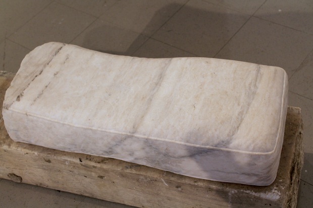
One of Sebastian Martorana’s marble couch cushions. It’s not visible in the photo, but these are covered in a subtly-raised floral texture
Michael: I also love another gallery that seems curated around a series of marble sculptures by Sebastian Martorana. They reference soft furnishings or pillows, but also the marble steps in front of rowhouses or old apartment buildings, which everyone in Baltimore uses like a communal living room in the summer. It’s a clever play between soft/hard indoor/outdoor furniture/architecture. These look really nice with Fred Scharman’s wall drawing “The Hypothesis that Love Stories are Stories of Form.” It’s an abstract geometric pattern that’s evocative of Islamic decorative motifs. Everything about this room feels equal parts pedestrian (stoop, graphite) and luxurious (marble, embellishment).
Whitney: I really was not crazy about the marble couch pillows, but again, I missed the references to Baltimore-specific marble usage. I just thought of them as something cool you wouldn’t normally see marble doing. I know I’m going to piss a lot of people off here, but I just don’t think materiality is a very interesting conversation on its own.
Corinna: Whenever I see something “normal” turned into marble, it seems like a faux-classical impulse. We must preserve this like the Romans, even if it happens to be a fairly cheap object of today! There are other materials out there, guys. Besides that, not much in the way of transformation was going on: They looked like seats, but they just happened to be made out of marble. Nobody I saw took the time to sit on them because they looked too familiar; they looked too much like art. If you want to make a monument to Baltimore, I’m sure there’s a more accessible way to do so.
Whitney: Yep, marble has been pretty popular around the Lower East Side over the past couple of years, along with plexiglass, hunks of wood, concrete, bags of sand, plaster…it’s kind of like what sculpture would look like if you walked into an enormous Home Depot of every possible sculptural material, and kind of half-sculpted them with a giant sandblaster in the warehouse while they’re still on the loading pallets. Want to give this a name? Neo-classical-grunge? Glassholes?
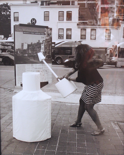
Image from Nora Howell’s “Wite-Out,” 2013.
Anyway…speaking of localized art-making, I really appreciated Nora Howell’s “Wite-Out,” just because it said something about the times—more than, say, a lot of the other vaguely Modernist and classical motifs that generally made the show feel underdeveloped. Howell interviewed Washington, D.C. residents about gentrification on the the U Street corridor, and asked them to choose a cleaning product which symbolized the change. This interviewee, Natalie Hopkinson, chose Wite-Out to talk about the psychological impact of gentrification. This comes with a human-sized soft sculpture of a Wite-Out tube, and a pretty literal photo of Hopkinson smearing the Wite-Out on a bus stop ad, neither of which add much to the piece. The interview, though, holds its own. Hopkinson talks about how, once white sunbathers started hanging out around the public pools, new rules declared that kids had to be accompanied by adults, so as more whites moved it loud neighborhood kids (not white, you’re led to assume) stopped coming to the pools. Hopkinson wishes that this would be a time for reflection on what whiteness means as a racial identity, and that whites would take ownership of that just like every black person has to. I find this a narrow view of gentrification, which is as much a global capitalist problem as a racist one, but it painted a pretty good portrait of the experience of displacement.
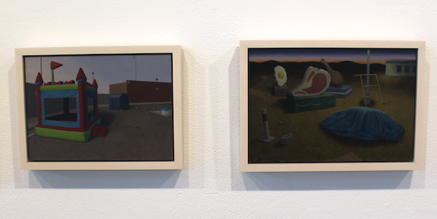
Nora Sturges, “Moon Bounce” and “Floats,” 2012. Oil on MDF.
Another highlight was Nora Sturges’s small, egg tempera-like, dusk-lit oil paintings of out-of-place prefab structures like greenhouses, playhouses, bouncy castles, and toy dinosaurs, in barren Arctic landscapes and parking lots. They’re fun and bleak at the same time, and she pulls off the surreality well.
Past that, there were few other highlights. I saw plenty of great freaky noodling in Baltimore, but it always seemed to turn into professionalized hair-splitting the second you stepped into an institutional building.
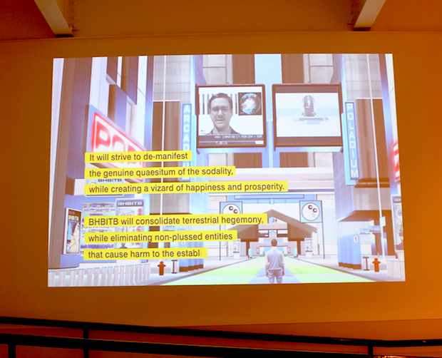
Joshua Haycraft, “Essentials of BHBITB: Nutrition, Habitation, Uniformation & Information,” 2014.
Corinna: Nora Howell’s interview made for one of the more timely—or at least “of this time”— pieces in the show. That, and the DIS Magazine-friendly, New Age-y video “Essentials of BHBITB: Nutrition, Habitation, Uniformation & Information” by Joshua Haycraft. I ended up looking this up after the fact, but Haycraft has given BHBITB its own website. From the site, here’s a little bit of introduction to this work, which I find to be a prime example of Poe’s Law, where it’s hard to tell the difference between parody and sincerity on the ‘net:
BHBITB is a self-sustaining organization focused on integrating the Four Pillars of Society (business, science, government, religion) into an efficient network of systematized units. The ultimate goal of these units is to design and fabricate the Perfect World™ , manifesting in new municipalities, replacing the old with the new. Our ministry’s current focus is education, spreading the accumulated wisdom of Dr. Stranton through videos, exhibitions, and seminars.
Sure sounds serious, until reading further to the send-off, which includes the BHBITB motto: Evolvere Privilegium. That phrase gets repeated in the video, too, and I take that to be a jab at normcore-in-all-its-guises, which, let’s be real, is just an embrace of privilege.
Whitney: That was a standout for me, too; Haycraft is building a religion for the implicit idealism in things like Web 2.0 and urban renewal projects. It reminds me of the Arab collective GCC’s current show “Achievements in Retrospective” at PS1, which mimics the language of luxury developers in the Persian Gulf. The video belongs in 2014.
Corinna: Back to the work, again, I didn’t find too many highlights in the dozens-plus work on view. I found a lot of material-specific projects, the type of explorations you’d make while in art school, but that don’t necessarily lead to solving any problems, formal or otherwise.
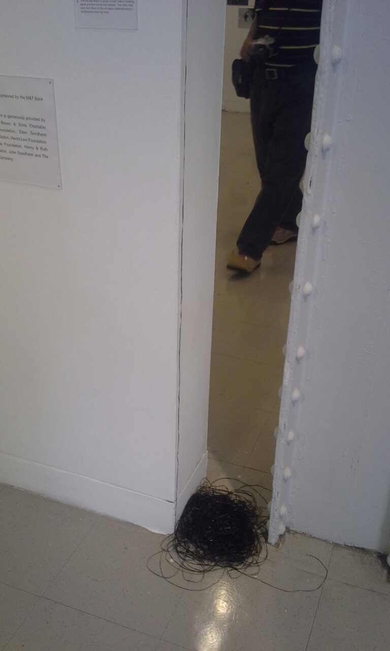
Lu Zhang, “Drawn Line,” 2012. Hand-cut acrylic on vellum.
Lu Zhang made a work, “Drawn Line,” that you’d barely notice, looking just like a thin line of black cassette tape spooling down a wall into a pile. According to the wall label, she drew a line in acrylic on two sides of a vellum sheet of paper. Then she cut out the acrylic lines with scissors. After that, she hung the strips, making a sculpture out of lines. I take no issue with artists—or anyone—pursuing personal projects just for the hell of it. But I doubt the bridge between drawing and sculpture remains so vast that we still need to figure out the formal relationships between the two.

Comments on this entry are closed.