
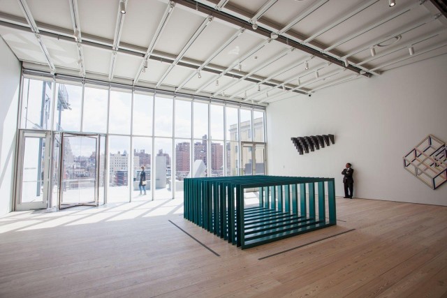
The Whitney, Installation view. Image via Jake Dobkin at Gothamist
Back in January I spent a good deal of time at the Perez Art Museum Miami (PAMM) looking at their permanent collection. Their exhibition Global Positioning Systems showed off highlights, most of which were produced within the last 30 years, and it was a sea of blue-chip contemporary artists. As I walked through the galleries, I wondered what made the museum’s collection that much different than what you’d see at other Miami collections like the de la Cruz’s or the Rubell’s. Longer wall labels I guess.
Now, that’s not particularly generous—much of the work focused on Miami-centric themes (urban development and growth, Latin-American Culture, changing economic opportunities)—but the visit reminded me of how necessary a collection based on scholarship and history (not market trends) really is. This past week, I remembered that visit to PAMM while touring the new Whitney Museum of American Art, and was nearly overcome with relief. Finally, an institution fulfilling its mission to present a full range of American art in the 20th century!
All of which is a rather long way of saying the Whitney’s America Is Hard to See, a massive survey of over 600 works by 400 artists in the museum’s 20th and 21st century collection is really great. In broad chronological and thematic strokes, the exhibition tells the story of America and American art-making. Works inspired by European Modernism kick off the 8th floor and between there and the sixth floor we see 50s abstraction, 60s pop art, and 70s minimalism. The fifth floor is dedicated to 80s video and performance, 90s political activism, and a hodgepodge of art from the aughts.
Generally speaking, the strongest groupings told the clearest stories. For example, an outstanding selection of artworks under the heading “Machine Ornament,” on the 8th floor, makes life at the turn of the century seem brutish and hard, but also filled with optimism. So while Charles Sheeler’s 1931 smallish painting of the River Rouge Plant in muted colors doesn’t seem particularly buoyant, Charles Demuth’s nearby depiction of a steel and concrete grain elevator he likens to Egyptian innovation (and perhaps slavery) seems luminous by contrast. Industry was everywhere and artists had mixed feelings about that.
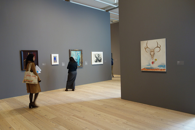
Georgia O’Keeffe
By contrast, we see artists from the same period working with themes of the American rural landscape just one floor down. Here, life is hard, but perhaps offers a bit more space for contemplation. The floating deer skull and antlers in Georgia O’Keeffe’s famed “Summer Days” presents a dreamlike space above the desert mountains; Edward Hopper’s crimson ocean invites long looking. Meanwhile, John Steuart Curry’s “Baptism in Kansas” shows the cult-like baptism of a virgin. Everyone looks like they’re in a trance—contemplating God.
While the Whitney’s collection proves a wonderfully comprehensive and inclusive history for the first forty years—that there’s even a section dedicated to black history is, by museum standards, sadly progressive—weak sections of the collection later on stand out. The museum pulls out their best Abstract Expressionists from the 50s, for example, but there’s nothing on par to what the Albright Knox or MoMA has in their collection. The Rothko is okay, the de Kooning woman is masterful, but then they’ve got this terrible little Jackson Pollock. It’s nothing more than a bunch of paint drips, which yes, describes them all, but most don’t look like cleaned-up drop cloths.
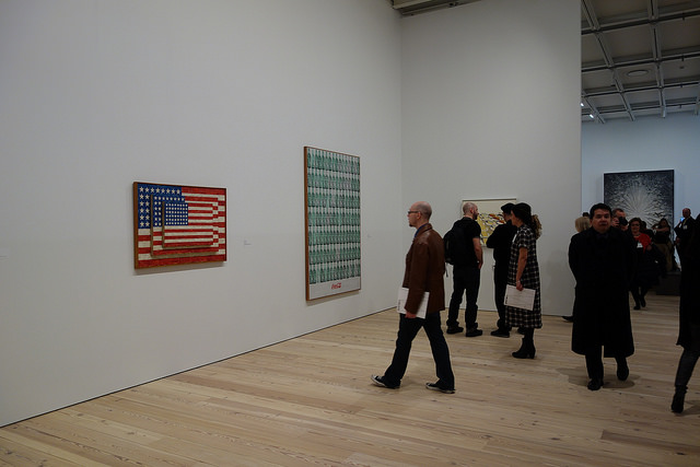
Jasper Johns and Andy Warhol in the Pop Art section of the show
You can’t fault the museum for showing the work—Pollock is an important artist—but the collection’s high points aren’t always where you’d expect them. There’s only one Warhol on view in the pop section, of the 121 Warhols they have in their collection. It’s a nearly 7-foot tall silkscreen of coke bottles and a good representation of what he does, but perhaps not significant enough on its own to represent his contributions to contemporary art. Similarly there’s also just one Roy Lichtenstein (a painting of paint), and no James Rosenquist. Meanwhile their pop-art high points hit the ball out of the park: they’ve got the Jasper Johns three flag painting, George Segal’s white figures under a walk sign, and Alex Katz’s painting of a girl in red lipstick. Even if you don’t care for these artists, it’s hard to deny that these works have an enormous presence in the annals of art history.
For me, though, many of the real treasures in this collection aren’t by the art stars (or at least not the ones as big as Johns and Katz). Jay DeFeo’s “The Rose,” a piece in a section dedicated to 60’s assemblage artists, stands out as a prized piece in the collection—and the museum knows it. It’s the centerpiece of the room, and it’s given the clearest sightlines of almost any work. The painting takes the form of a star-shape relief, with a textured surface so built up that some layers look like rock or concrete. Despite its heavy materials, the strong shooting “petals” of the piece seem to make it glow. I actually got teary looking at it.
Nan Golden, Ballad of Sexual Dependency, 1979-1996, slideshow
I had the same reaction later in the 90s section on AIDs activism and death. It’s not just that David Wojnarowicz’s photographs taken minutes after his friend and onetime lover Peter Hujar died of AIDS were tragic, or that Hujar’s nearby gritty photo of Wojnarowicz smoking (also now dead of AIDS) were somehow descriptive of city life. But that together, somehow you had a better sense of what was lost: relationships, eloquence of expression, poetry. Moments later, I watched photographer Nan Goldin’s “Ballad of Sexual Dependency,” a scored slideshow of images she took of friends doing drugs, having sex, or just hanging out. I caught the end because the loop failed to start again. I saw only her shots of tombstones.
It’s hard to imagine a clearer portrait of the time, and it plays to the Whitney’s true strength: scholarship. What the Whitney doesn’t seem to do as well is securing the most prized work of contemporary art-market darlings. This may be nitpicking, for all big-name artists on display in the Post-9/11 section—Caroll Dunham, Mark Bradford, Nicole Eisenmann, and Dana Schutz to name a few—almost none were major works. We’re offered a large black-and-white drawing by Schutz depicting the construction of a ship. It’s great, but not on the level of, say, her painting “Presentation,” in which a mutilated figure surrounded by crowds is lowered into a pit. That work is at MoMA. The Whitney similarly has a good, but not outstanding Nicole Eisenmann painting picturing downtrodden working-class fellows mixing globs of gook on a table. After having seen so many incredible works at her retrospective at the ICA in Philadelphia last year, I was a bit bummed that museum had never secured a painting of the caliber of “Captain Awesome” or “Were-Artist“.
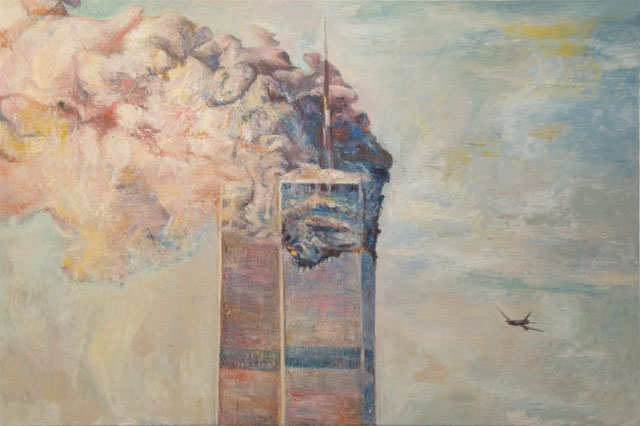
Keith Mayerson, 9-11
All that said, a pinkish Keith Mayerson 2007 painting of the trade towers burning—almost certainly amongst the best of his works I’ve seen—hung in the air like smoke. 9/11 changed every American in some way, and while Mayerson’s deadpan rendering doesn’t tell us how, perhaps it doesn’t have to. It was painted six years after the attack, and on view 14 years after, there’s not a soul who doesn’t know what that image is about. We’re still tending the wounds.
Of course, there are outliers in any collection, but the Mayerson seemed special to me. This jewel is a little less likely to have a home with collectors like the Rubells—he’s not as recognizable a name as Schutz or Harrison—and yet does the essential job of creating context for a period in which we’re still trying to make sense. That scholarship won’t be finished anytime soon, but if the Whitney’s show is any indication, the museum’s work be among the clearest when we reflect on what this work means years from now.

Comments on this entry are closed.