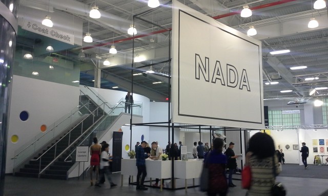
NADA Installation shot at Basketball City
Venues make a huge difference to fairs. Take NADA, which is perhaps best known for their ballroom take over at the Deauville Beach Resort. The space is ugly and awkward and filled with enormous chandeliers, but no one forgets it. It’s weird, which in the emerging fine art world is an accolade of high order. (This year, they move to even bigger ballrooms and chandeliers at Fontainebleau hotel.)
It’s not surprising then, that their New York location at Basketball City has taken some time to get used to. Now three years in, the complaints seem to have died down, but in 2013 even some board members complained to me privately that the venue lacked personality. In their opinion, the Miami ballrooms were better.
I don’t share that view, and it’s the shortcomings of their most recent NYC fair that have made this clear to me. The most successful works in years past—the Hole’s bodega-styled booth or Shoot the Lobster’s booth in a parked car—worked because they were accessible to anyone regardless of class, age, being an artist or collector. Basketball City shares that quality. Anyone can play in the basketball court. Sticking a bunch rectangular grid of booths inside a rectangle may not seem all that interesting, but seems it’s simple and it doesn’t present as anything other than what it is: a middle-tier art fair for emerging artists.
Compare this to the ballrooms, which ferry off a kind of aspirational location-specific branding. The problem isn’t just that hotels like the Deauville or Fontainebleau aren’t accessible to all, but that the aesthetic of the fair has the feel of a “quick and dirty” fix that those tight on money might require. Usually, the main reason to present in a venue a fair can’t completely transform with booths is to cut costs.
But does NADA really need a cheap venue? Many of their dealers do very well, as does the fair, which has been officially endorsed by the mother of all Miami Fairs, Art Basel. Last year, there were reports of collectors, stuck in traffic to the fair opening day, frantically calling dealers to put aside works for them. By any standard it is a success.

That kind of class posturing can and does turn people off of NADA but it’s not a localized phenomenon. NADA’s location branding, for example, doesn’t seem all that different than Eastern District, a fancy cheesemonger in Greenpoint that uses a weathered yellow sign with pseudo-Deco block letters to spell out the name of the store. The bodega itself appears to be decorated shiny versions of shelves and freezers store owners leave behind when they move—as if it were a scrappy business. In reality, it sells $30 lb cheese and $7 morsels of cheese to wealthy young hipsters.
Price points have an obvious connection to NADA’s class branding, but so too does the immigrant store owner, the stylings of which are often appropriated in the food world. There are many reasons for this, but perhaps the most obvious is that it represents a nostalgia for old local communities and lost knowledge. NADA’s trademark loud, overstated architecture in Miami similarly suggests a kind of reclaiming of connoisseurship that cuts across all creative fields: obsessive to the point of nerdery, thoughtful, playful and unusually willing to take risks.
I love those qualities about NADA, and frankly, the Basketball courts don’t communicate that sensibility as well. They do, however, present a slightly more honest representation of their class and status, as well as offering the kind of openness I’d like to see from the art world. And for that reason, the courts have my favor.


Comments on this entry are closed.
{ 2 trackbacks }