
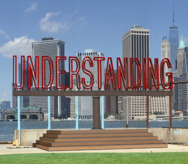
Rendering of Martin Creed’s forthcoming “Understanding” installation in Brooklyn Bridge Park.
Next month, Public Art Fund is installing Martin Creed’s “Understanding,” a 50-foot rotating neon sign, on Brooklyn’s Pier Six. That’s about a 20 minute walk through the Brooklyn Bridge Park Greenway from “OY/YO,” the popular public sculpture from Deborah Kass that’s on view until August.
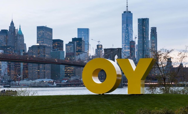
Deborah Kass, “OY/YO.” The piece reads “YO” when seen from Manhattan and “OY” when viewed from Brooklyn. Of all the word art floating around Brooklyn right now, this is our favorite.
Which got us thinking: why do New Yorkers love one-word giant public text sculptures so much?
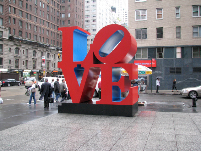
Robert Indiana, “LOVE” on Avenue of the Americas and 55th St.
Robert Indiana’s iconic 1964 “LOVE” sculpture on Avenue of the Americas is so popular it has it’s own Yelp page (with 4.5 stars, to boot). There’s a second, schlockier “HOPE” version a few blocks away on 53rd and 7th.
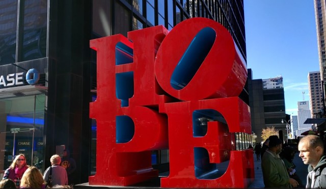
Robert Indiana, “Hope” at 53rd St. and 7th Ave.
Is a word worth a thousand pictures? Tourists love to take selfies in front of these. Perhaps people like iconic, single-word text pieces because they’re so instantaneously “legible.” They’re as recognizable as a brand, like watermarking your vacation photos so everyone knows exactly where you were. People like taking pictures of text blocks in public spaces so much, some exhibitions are curated specifically with that in mind. Last year, the Public Art Fund commissioned yet another text-based project in Downtown Brooklyn, this time in partnership with Instagram. They organized a crowd of popular Instagram users to visit hank Willis Thomas: The Truth Is I See You (installed in MetroTech Commons until June of this year) and document these kinda silly works.
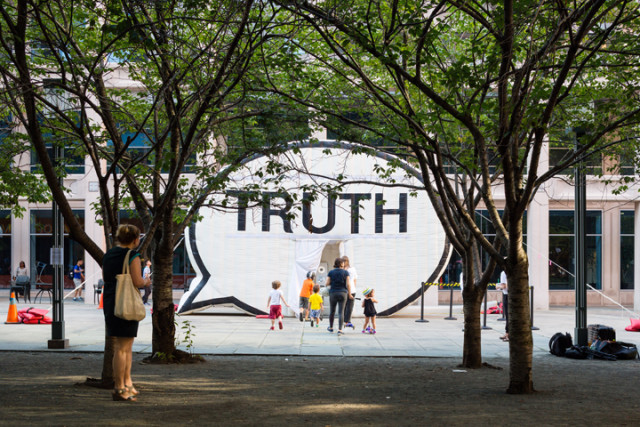
Hank Willis Thomas at MetroTech Commons
This might point to a minor crisis in the world of public art: after modernism, no one seems to know what to do with public sites. There was a time when one could plump something steel and abstract in a plaza and call it a day. Abstraction is inoffensive and open to interpretation. Language is one step further in that reduction. There are precious few singular words that are offensive on their own. But two or more words state an opinion. A single word can appear loaded without saying much.
There are exceptions, of course. At the height of the recession, in 2008, Marshall Reese and Nora Ligorano installed “ECONOMY” in front of the Supreme Court in Lower Manhattan. The letters were cast in ice, and gradually melted and crumbled throughout the day.
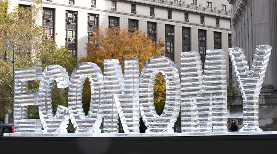
Marshall Reese and Nora Ligorano, “ECONOMY,” installed in front of the Supreme Court in 2008.
Other artists have used a single bold word to queer the city’s ubiquitous advertising—most famously, Barbara Kruger’s untitled commission from the Public Art Fund in 1991. In these bus shelter posters, the word “HELP!” directed passengers to a smaller blocks of text, wherein a fantasy world populated by pregnant men in crisis was described. It was strange and great, possibly moreso for the general public.
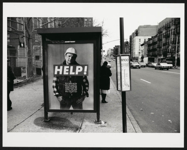
Barbar Kruger, untitled, 1991.
But those same, once-subversive tactics artists appropriated from advertising have a way of finding themselves back in the hands of corporations. In 2011, Target commissioned a giant “READ” display made of Doctor Seuss books as a promotion. The books were donated, but it still felt more like an act of branding rather than a magnanimous gesture.
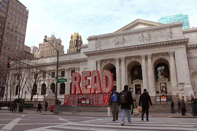
David Stark at the New York Public Library in 2011.
At any rate, it looks as if we’ll be doing a lot of very-short-form reading while looking at public art in this city for the foreseeable future. Especially in Brooklyn. The trend isn’t just limited to “official” public installations though. Last year, Studio Sweet Home presented a quasi-public exhibition by Yeimi Salazar and Melvin Sanchez in the lot at Exit Room NY. I think, of all the oversized words floating around outside, these are my favorite:
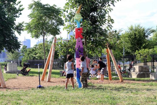
Yeimi Salazar and Melvin Sanchez, “Tragedy” 2015.
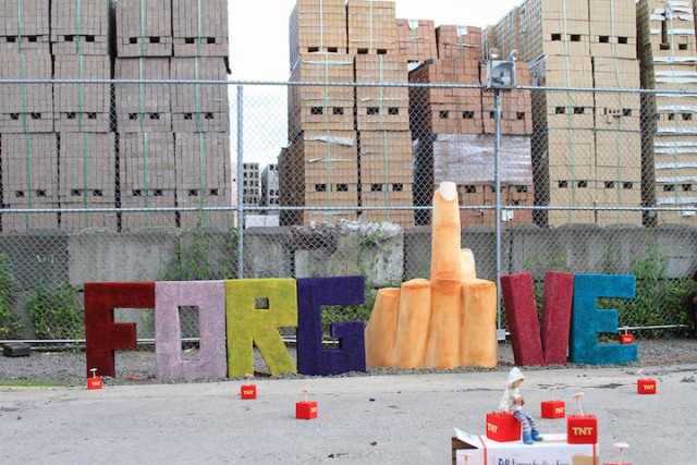
Yeimi Salazar and Melvin Sanchez, “FORGIVE” 2015.

Comments on this entry are closed.