
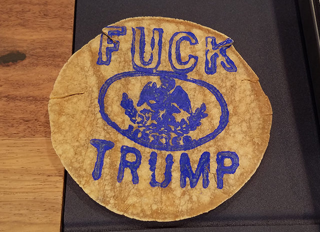
A mystery artist has been leaving these silkscreened tortillas around the fair. I spotted this (appropriately) in Anonymous Gallery’s booth. The gallerist loved it.
Last year, I remarked that Zona MACO excels at being an “average” art fair.
I stand by that opinion this year, with the clarification that it feels a bit like the average of many art fairs: a bit of NADA, a big dollop of Design Miami, a dose of Basel, and flavors of Frieze. That makes sense, as it’s by far Latin America’s largest and most important art fair—many of the curated identities of fairs in hyper-saturated US markets come from necessity of branding when there’s competition.
And like I said last year, that’s not necessarily a bad thing. Though this year, due to some floor plan rearrangements and somewhat less cohesive booths, the curated sections Zona MACO Sur and Nuevas Propuestas felt a bit underwhelming. That might also owe to (what seemed like) an increase in advertisers’ kiosks and design, publication, and food vendors.
The good news: the quality of work in the General Section improved tremendously. Sure, there were many repeat, predictable artists, but the recent political turns in both Mexico and the United States haven’t gone unnoticed in the art world, and that’s had a positive effect on the art here. Scattered among the rows of polite abstraction, there’s plenty of outright political work, particularly when compared to the December fairs in Miami.
Yes, people love to complain about the hypocrisy of political work made for billionaire collectors or virtue-signaling-as-spectacle or some other biting-the-hand-that-bites-the-hand-that’s-feeding-us-all problem. But I for one am almost always glad to see politics making an appearance in the high-end art world. These voices are needed—now more than ever.
Below, a sampling of the what’s on view, beginning with some of the more overtly political works:
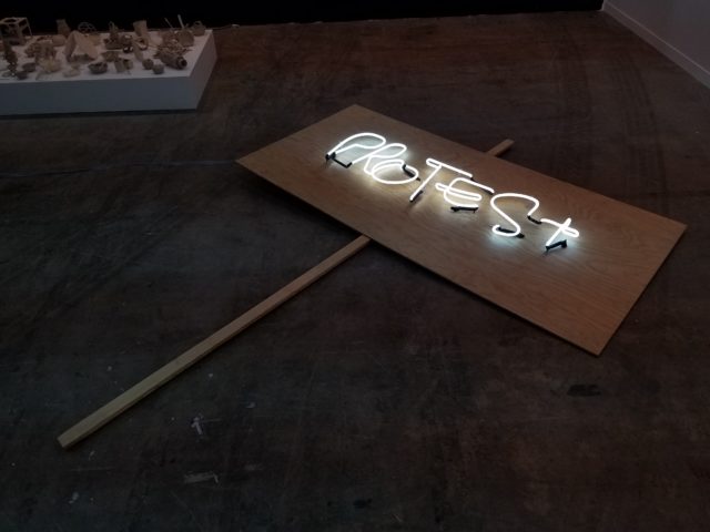
Didier Faustino, “Occupy Protest Riot,” 2016 at Parque Galería.
Protest signs have obviously been getting a lot of attention as of late. I like that this implies we’ve now entered a permanent state of unrest, in which the lights will always be on, like a 24/7 bodega of discontent.
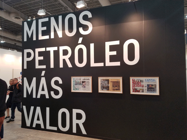
Rirkrit Tiravanija at Kurimanzutto.
Rikrit Tiravanija addressed the shit sandwich that is the Trump presidency and Mexico’s gasolinazo (the popular term for the neoliberal government’s decision to privatize Mexico’s oil) pretty head-on. The text reads “MENOS PETRÓLEO MÁS VALOR,” less oil, more value/”valor”, which I believe is a play on words, meaning “valor” as in “courage” or “morals” and also “value” in the economic sense. The wall also features a triptych of newspaper covers from #J20, Trump’s inauguration, each printed with the text “Fear consumes the soul.” The gallery is also showing these landscape paintings by Minerva Cuevas, which appear to be dipped in tar—another comment on our fraught relationship with petroleum products.
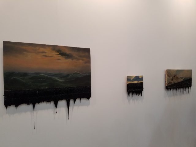
Minerva Cuevas at Kurimanzutto
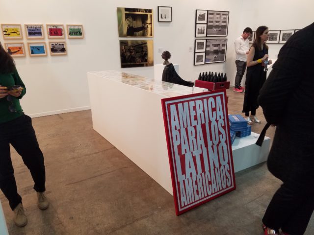
Humberto Márquez,”América para los latinoamericanos,”1971. In Henrique Faria Gallery.
In ZonaMaco Sur, the area where galleries present solo projects, New York’s Henrique Faria Gallery has a nice retrospective of the Mexican artist Humberto Márquez. All of Márquez’s work has a slick, pop-art sensibility but is deeply critical of both Mexican and U.S. politics. I can’t think of a more timely piece, given how displeased both countries are with their presidents.
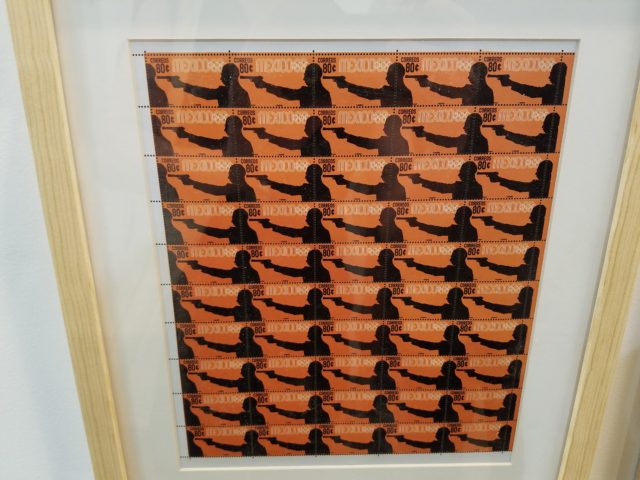
Humberto Márquez, “Preolímpicos,” 1968.
I love these step-and-repeat stamps, these made in time for the controversial 1968 Olympics in Mexico City, mimicking the event’s graphic design (to this day, the metro system uses the same typology/graphics from the games). Another, later series of stamps illustrates various “exports”, from refugees to marijuana.
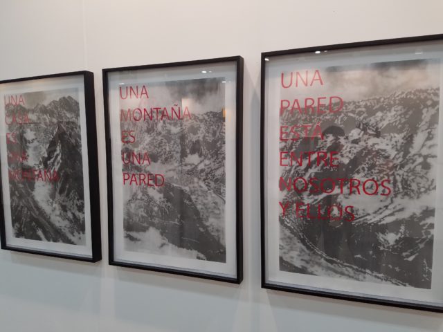
Javier Barrios at Páramo.
These delicate drawings (of the US/MX border?) translate to “A HOME IS A MOUNTAIN,” “A MOUNTAIN IS A WALL,” “A WALL IS BETWEEN US AND THEM.” I love this piece, but will Mexican collectors pay? [Sorry, officially worst art-fair pun I have ever made.]
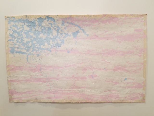
Manuel Solano, “America Is The Greatest Country On Earth 2,” 2012.
Karen Huber again showed work from Manuel Solano, including this flag and the video piece “To Lose Yourself is Eternal Happiness,” a collaboration with Damien Moreau. In the piece, Moreau and Solano make out in the woods. It’s pretty cute.
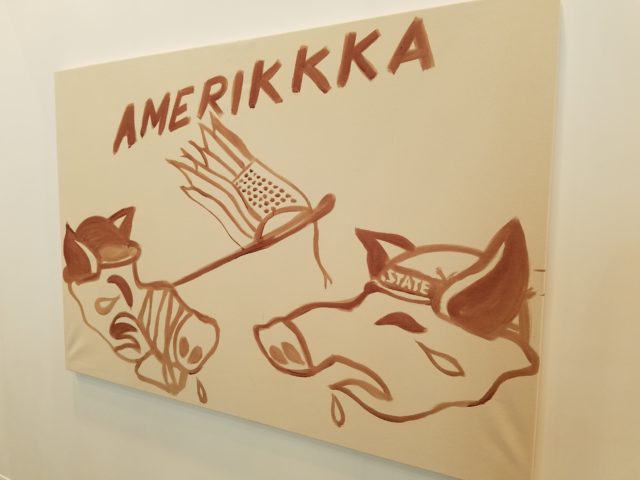
Juan Capistran at Galería CURRO.
My boyfriend and I simultaneously exclaimed “PIG BLOOD!” at each other in Galería CURRO’s booth. Having collaborated on a series using this very substance, we found it immediately recognizable in Juan Capistran’s “AMERIKKA”. I have to say, it’s a surprisingly pretty and versatile pigment (no pun intended) but will forever leave an almost-vomit-inducing stench in your studio for months. Also at Galería CURRO, this sculpture which combines my two favorite contemporary art trends—fluorescents and houseplants:
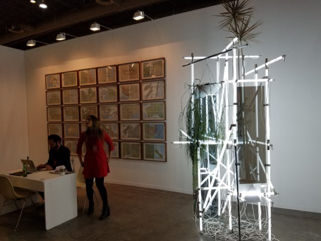
Alejandro Almanza (sculpture) in Galería CURRO
Maëlle Gallerie
Paris’s Maëlle Gallerie had one of the fair’s strongest booths, a two-person show featuring artists from the French-speaking Caribbean. Jérémie Paul’s painting of muppets having lesbian sex is probably one of the best things I’ve ever seen at an art fair. The fibers pieces from Julien Creuzet are so different, but so well-matched.
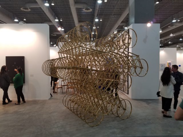
Ai Weiwei, “Forever (Stainless Steel Bicycles in Gilding) 3 Pairs, 8 Layers,” 2013. At Lisson Gallery.
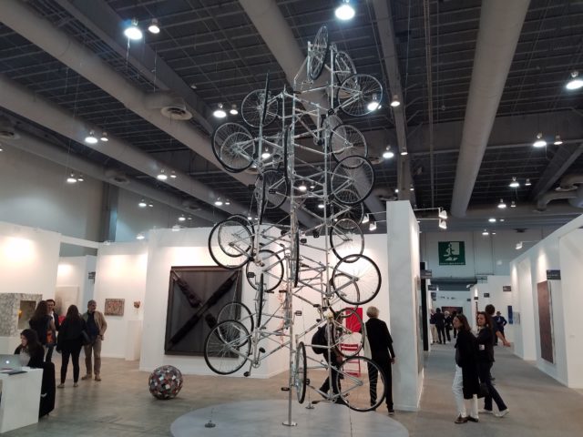
…And a few booths down, at Italy’s Galleria Continua, more Ai Weiwei bikes: “Very Yao,” 2008.
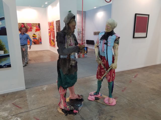
Folkert de Jong at local gallery Luis Adelantado.
These guys were one of my favorite sculptural pieces at the fair. Up close, you can see all these recognizable textures, such as bubble wrap for chain mail. In retrospect, these are memorable because they’re among the very few sculptural works in the fair that look like they were fun to make, as opposed to the endlessly bountiful, high-production fabricated objects.
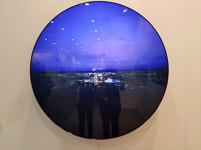
Doug Aitken, “Hot Mess: Aperture Series,” 2016 at Regen Projects.
This back-lit photo of Las Vegas with the text “HOT MESS” gets a nod for being one of exactly two pieces in the fair that made me laugh.
MARSO
Mexico City’s MARSO had one of the most talked-about booths at the fair, largely thanks to Lucas Simões, whose installation “Perpetual instability” mimicked the convention center’s concrete floor is a spongy, cracked material that sank as you walked on it. Mostly, this reminds me of every sidewalk in Mexico City.
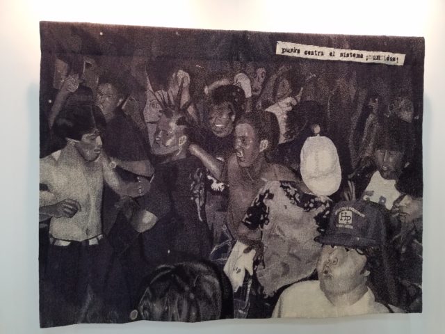
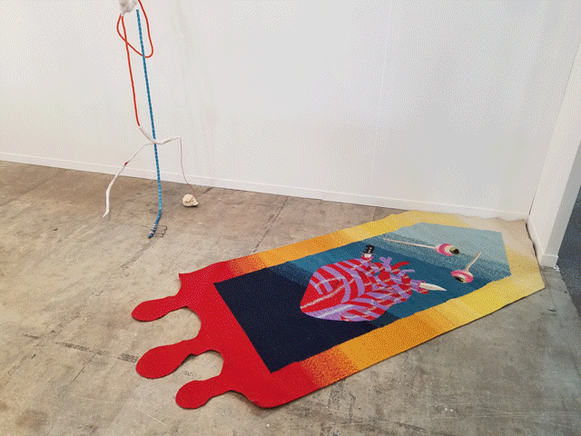
Plush hooked rug by Israel Martínez at Arredondo \ Arozarena.
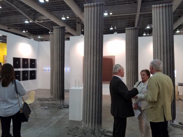
Christian Andersson, “Column Shreds,” 2015 at Galerie Nordenhake.
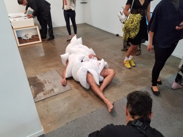
I have no idea who this performer was, but he was roaming the convention center for the duration I was there. When fair fatigue set in I envied this garment choice and pose immensely.
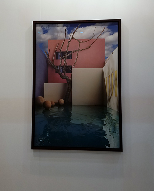
James Casebere, “Flooded Courtyard with Tree,” 2017 at Lisson Gallery.
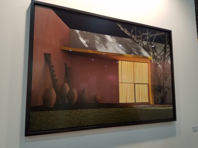
James Casebere, “Yellow Overhang with Patio,” 2016 at Sean Kelly.
I was happy to see these photos from James Casebere in both Lisson Gallery and Sean Kelly (where Casebere recently had a highly-praised solo show). Casebere painstakingly recreates buildings designed by Mexican architecture legend Luis Barragan as models, and then photographs them. Seeing these printed large is lovely, because up-close you can see the texture of paper, twigs, etc… the artist uses to create these convincing illusions.
The nipple-minimalist “Trojans Polyptych,” by Zilia Sánchez at Galerie Lelong.
Pipilotti Rist, “Untitled 2,” 2009 at Luhring Augustine.
Sanya Kantarovsky, “Presh,” 2017 at L.A.’s Marc Foxx Gallery.
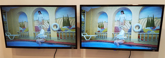
GIF of video stills from Fluct at Anonymous Gallery.
Brooklyn/Baltimore performance duo Fluct had a video diptych and photo triptych at Anonymous Gallery. Apparently, these pieces are an experiment/commentary about the difficulty of translating dance to a commercial gallery market. True to their perpetual risk-taking, Monica Mirabile and Sigrid Lauren managed to make some truly idiosyncratic documentation that I actually wanted to watch. The dance itself reminded me of “testing the waters” and eventually “taking the plunge”, apt figures of speech to re-translate back into movement when embarking on a new phase of one’s practice.
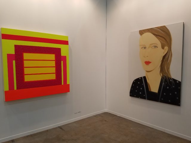
Peter Halley and Alex Katz at Javier López & Fer Francés.
I’ve started a tradition at art fairs, where I challenge whoever I’m with to spot the first Alex Katz. There’s always at least one.

Comments on this entry are closed.
{ 3 trackbacks }