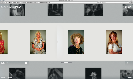
Sometimes the right idea comes along, but it goes to the wrong brain. That's what happened with MoMA's Cindy Sherman exhibition website. MoMA had the good idea to put up hundreds of images online, and in a rare move for the museum, they hired an outside team to design the website. The bad news: it's a drab, gray mess of navigational tools and small images. I had expected some bells and whistles, but all I got was a glorified slideshow.
At first glance, the website does what any good art gallery site does—there's a checklist, some installation shots, and a schedule of upcoming events. But problems started when I tried to do anything other than look at the front page. There're hundreds of Cindy Sherman works to view, but they can only be sorted chronologically or by gallery name (which MoMA curators organized largely by body of work). Try to sort by “clown,” “film,” or “sunburn”—which many would want to do—and you're out of luck. No tagging exists on the site.
Even if I did find my favorite sunburned Sherman photograph on the site, it's not like I can do much with it. I can't zoom in to look at the images in detail.
Another obstacle to the site lies in its mystifying arrangement of navigational tools: for example, the website's multiple scrolling function. Strangely, the website provides two horizontal scrollbars within the site—the middle scrollbar lets you speedily run through the images and the second one lets you click through images individually. Just one would do. And unlike the horizontal scrollbars, the vertical one is browser-based, which makes navigation on the site a disaster. Standards, anyone?
Over email, site designer Marc Kremers described his concept for Cindy Sherman's site as one of intimacy. “There’s an intimacy you can have while appreciating art online,” he told us, “but for some reason, most digital exhibitions belittle the artwork by drowning it with navigational elements, information and underwhelming image sizes.”
On those criteria, the site design only partially succeeds. Kremers hides unnecessary text and minimizes—or, at least, makes “minimal”—the navigation, but then brings in a gimmicky depth-of-field effect (probably to ease loading times) that leaves only four images properly visible at any one time. Even those, frankly, are a little on the small side for serious looking.
Whatever the virtues of intimacy as a design philosophy, it takes a backseat when usability issues interfere with a smooth, comfortable scroll through a website. We're all for MoMA's stress on high-quality web content, but this time, MoMA's investment just didn't pay off.


{ 9 comments }
 it looks like deviantart. maybe she was going for that? :/
I am pleased with the MoMA Cindy Sherman exhibition website. It follows the tone of Sherman’s work. The website serves the purpose as a supplement tool for the exhibition.
Who says that a website should be a “supplement tool”? A website should be able to stand on its own, especially when a museum has invested so many resources into its development.
Some people are full of jargon, Corinna. It’s called their PR people in disguise.
It is apropos, a “disguise” much like Cindy Sherman’s work.
Perhaps, rather than the website as a supplement to the Sherman exhibition, the website “complements” the Sherman exhibition.
i think the site was made in the context of a museum show…in a museum, you’re not able to sort by different tag words but are given a certain way to view the artwork. Â
Also, the website does well in eliminating a lot of the technology that makes a lot of websites irritating. Â I was able to figure out the website in seconds.
It is a little on the grey side, but otherwise I don’t mind it. Â I appreciate the lack of clutter. Â
And you can share specific images. Â Here’s the link I got when I tried to share something via twitter: Â http://www.moma.org/interactives/exhibitions/2012/cindysherman/gallery/2/#/6/untitled-film-still-50-1979
it’s actually quite nice if you use the arrows on the keyboard instead of the mouse. Â For the film stills, it’s a real gem to be able to see them all like this. Â
Comments on this entry are closed.