Winkleman Gallery, 637 West 27th Street
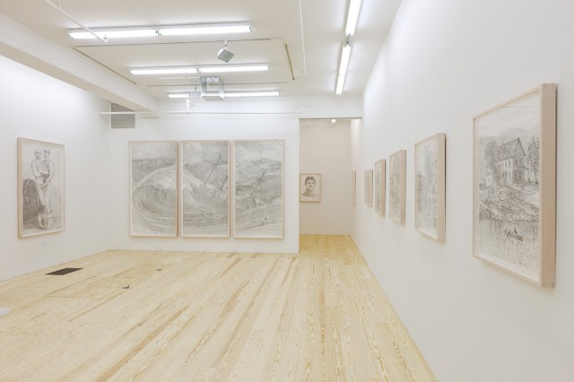
(Through 2/9) Michael Waugh: “Offenses Against One’s Self”
Corinna Kirsch: I’m fairly happy with Michael Waugh’s video The Invisible Hands. I can appreciate it as slapstick, and it fits right in line with a history of video showing artists failing at something simple. For one, there’s Bas Jan Ader who made videos showing him falling, off his bike and off his roof. The video shows two separate scenes: of the artist sweating away in a gym while seated at a rowing machine, then at the end of the video, attempting to row an actual boat. It capsizes. OK, not the best thing ever, but good enough.
Other than that, most of the drawings don’t do it for me. From a distance, the drawings show romanticized portraits and scenes of sea and land, but up-close, you can spy how the strokes are composed of text, and not line. The text comes from Adam Smith’s The Wealth of Nations, but it’s hard to know that without reading the press release. It just seems to be a whole lot of labor without much profit. Eh, maybe that’s the point?
Will Brand: For me, part of the problem is revealed in the way the press release explains The Wealth of Nations and The Theory of Moral Sentiments. The former, it’s explained, “has been used to argue for the elimination of laws limiting capitalism and for promoting a libertarian, greed-is-good ethos,” while the latter is “seemingly at odds with the notion that entrepreneurial greed could be good.” In truth, Wealth of Nations is very much anti-greed, and Theory of Moral Sentiments doesn’t contradict Wealth of Nations, it completes it. In both cases, it’s pretty clear we’re not talking about the content of the books, we’re talking about somebody’s idea of what they’re probably about. Reducing the books to just their text, as Waugh’s doing, would seem to be the exact wrong way to make art from that starting point.
Paddy Johnson: Galleries typically write their press release for the artist, so I suppose you could make the argument that that’s the gallery’s mistake. Still, an artist always needs to approve the release, and since Waugh once told me he doesn’t read the text he’s using, I think we can criticize the artist on the grounds you laid out. [UPDATE: I’m told that was only the case when he using government documents. He has read the Wealth of Nations in its entirety.]
I’d add to all this that while I agree with Corinna’s assessment that’s Waugh’s video was the strongest work in the show, the piece often suffered from the same predictability we complained about in his drawings. It’s kind of funny when Waugh learns that his work on the rowing machine didn’t help him on an actual boat but the boat capsizing doesn’t add to the joke. Similarly, the video ends when he finally walks off the screen in the gym, rather than when he finishes with the rowing machine (which we see moments before). This kind of redundancy is akin to a narrator telling viewers the phone rang, only to have that information followed with video footage of an actual phone ringing. It’s amusing, but not in any way that benefits the artist.
Derek Eller Gallery, 615 West 27th Street
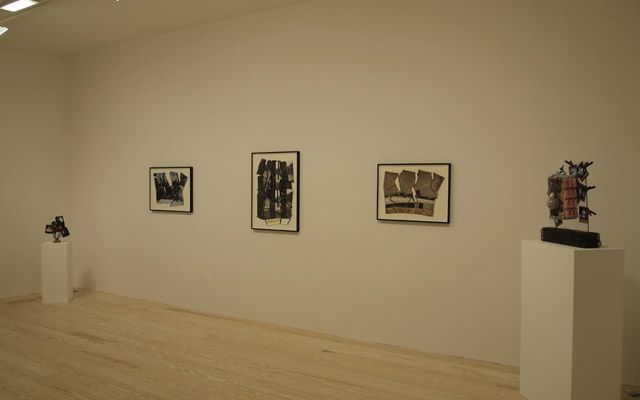
(Through 2/9) Thomas Barrow: Works: 1974-2010
Corinna: Here’s what we know about Thomas Barrow: in the 1960s and 1970s, he was an up-and-coming photographer showing with the biggest photo-only galleries like LIGHT Gallery. But he also worked as a curator and director, starting out in Rochester at the George Eastman House and then he ended up in New Mexico. As we know, taking that institutional route sometimes leaves one out in oblivion. That’s pretty much where Barrow stands right now; he hasn’t had a solo show in New York since 1996.
Maybe I have a soft spot for history’s forgotten artists (see my review of Bill Bollinger at SculptureCenter), but I liked this show. In 1984, Barrow wrote:
I want to alter the photographic surface—that is, move from the transparent, window-on-the-world form that has been photography’s primary reason for being since its invention, to making it a physical object…
That’s what he’s doing, and to an absolutely ridiculous degree with his photo sculptures, photo cabinets, and bags full of photographs. Photos are everywhere in this exhibition, but for the most part, they’re not inside a frame. With that in mind, it’s not so strange to see a bowling ball sculpture tacked on with photos covered in glue. It’s great. In one photo sculpture, there’s a even a hidden garden gnome. Who the hell knows why he’d do all that, all in the name of making photography into a physical object. But his sculptures are fun, and they’re in the same vein as what a younger artist like Katie Steciw is doing with digital imagery, someone who’s making work that’s not strictly 2-D.
Paddy: I think this show benefits from a good narrative. Derek Eller studied with Thomas Barrow, he’s always wanted to work with him, now he’s able to do this exhibition, and bring fresh eyes on this once up-and-coming star. There’s a lot of personal interest here, but I’m not sold on the work.
That said, the lede image for this show, Horizon Rib, f/t/s, Cancellations is very strong; a black and white photograph of a silver shed with tiny electrical wires in an x, placed over top. The lines of the wires break up the image, as though it were under glass, but do so in a visually pleasing way. The image at once feels precious and on the verge of being discarded.
There’s a few more successes like this amongst the photographs, but the work is uneven; sometimes the wire did nothing to activate the picture plain. I wasn’t as taken with the sculptures as you. I guess it’s good that the glue that hinges photo to the bowling ball in Millennial Notes was a matching color, but the arrangement is awkward to the point of being ugly. I never have any understanding why a photograph or an object has been selected, let alone placed where it is. Detritus was the lowest point in this respect, a piece that was literally a bunch of garbage in vacuum packs. There’s a level of randomness to this work I just can’t get behind.
On a related note, I have a personal bone to pick with the word “detritus” as used in the art world. It’s almost always used to elevate “garbage” into something precious, smart and saleable and I find that a little dishonest. In reality, the work label is almost always none of these things, so I’d prefer we just call it what it is; garbage.
Foxy Production, 623 West 27th Street
(Through 2/9) Sascha Braunig: Wrister, Blister, Plaster
Will: When we saw Braunig’s first show last year, I was interested but not quite sold; there was something to these seated portraits of Op art-clad aliens, but they weren’t quite all there yet (Ken Johnson and a few other people picked up on the show, too, with pretty much the same outlook). This show is better, so that makes it pretty darn good.
Braunig’s first show, as I recall, had a couple of paintings where the colors just didn’t quite work, and eliminating those went a long way.
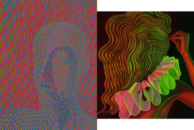
The two works pictured above are my favorite and least-favorite works in the show, Claude and Bossy Pins. I think they’re representative. Claude’s got a few things going for it that are common to this whole show: it’s hyper-vividly colored (Braunig cites Enter the Void as an influence); it plays different styles of mark-making off each other to create or destroy space (in this case, the Monet-like strokes referenced in the title break the sitter out of the Op art rigidity of the ground); and it’s got some surrealist mystery appeal.
The paintings of Braunig’s that I don’t like are the ones that are less Easter Island surreal and more Magritte surreal. Magritte surreal is like Bossy Pins, in the realm of insights you get when you’re really high or eight years old: “Whoa, what if there was a lady and her face was made out of hair only her hair was made out of snakes?” Easter Island surreal is more like Claude; the thing already exists, and here it is looking at you. Deal with it.
Whitney: Will, I’m calling you out on the above paragraph. If you’re going to determine that something’s good, then you’ve got to give people something they can work with other than one is cool because it reminds you of something. I think you’re comparing Claude to Easter Island because it’s a distorted head without features and Bossy Pins to Magritte because the figure’s shown in photorealistic detail. It’s not a helpful distinction, especially when the whole show depicts figures in various stages of being woven together.
I thought these were beautifully painted, colors work (if that’s even reasonable), and the op contrasting with hyperrealism just immediately made me think that we’re in a new phase of painting; people seldom mixed distinct painting styles til recently. This also may be a superficial observation, but the palette and shapes look digital to me, making me think about how the internet’s creating a new space for culture. (The acid-colored Medieval figure in “Wrist Painter,” in particular).
In terms of shows that work with deconstructing the figure and mixing genres (something we’ve seen a lot recently), this one’s at the top of my list, possibly just because it does it more elegantly than most. It helps that Baroque painting and op art naturally mix well together (both stay within the lines) but that brainy head is a pretty innovative way of turning something both inside and out at the same time, making something both contained and extending into the space around it. It achieves genuine surreality.
Will: Damn dude, I don’t know what Immutable Rule of Taste the good ones follow, I’m just saying which ones I liked and trying to draw something out of that. Foxy Production has 36 of Braunig’s works on their website; here’s 14 of them sorted by those two categories:
Easter Island spooky blank surreality: [1] [2] [3] [4] [5] [6] [7] [8]
Over-the-top “whoa what if” surreality: [1] [2] [3] [4] [5] [6]
I think it’s a reasonable system. I like the first set better.
Whitney: Why?
Will: Was that the question? I thought you were saying the distinction wasn’t helpful. Anyway, it’s because I like “spooky” better than “bizarre.”
Whitney: Yes, exactly. Going around picking things you like because you like them is not helpful criticism. That conversation goes nowhere.
Corinna: I’m not even sure if I want to get into this argument at this point, but here goes nothing. Braunig’s paintings work best when they’re doing more than just hurting the eyes. That can happen in both the “Easter Island” and “Magritte” veins, and I think the better ones have more to do with how she uses paint—up close, some of the paintings are less elegant and detailed than I’d expect, like they’ve been painted between strips of tape.
Paddy: Whitney, I also picked out Claude as a more successful painting in the context of that show and yes, it was because of the level of abstraction. To my mind, the more realistic the paintings get the more they seem derived from other sources. There’s basically no way to look at a painting like Prop for example and not think of Fantastic Planet. Now, that’s not necessarily a problem. There are plenty of reasons to make work that feels familiar, (Brent Green’s work is a good example), but none of that rationale is laid bare here. So, in this case, I wonder what purpose those references are serving.
Fister, arguably stands out the most in the show, because the background is treated as one might paint a traditional portrait. There are lots of great details in this piece—the mink face in the coat amongst them—but there are moments when it falls apart. The most obvious is Braunig’s treatment of hands; you can see shaky brushmarks delineating the hand and background.
All this is to say, that while, yes, the melding of genres is successful, I think there’s room for improvement. There may be more room for an artist to maneuver in the representation, but she’s already nailed the more abstracted heads so why not run with that? I know you don’t think this conversation is particularly useful when looking at the show as whole—each are part of larger body of work showing the heads in various states—but Iooking at Wrist Painter and Untitled I find it hard to agree that the show shouldn’t be disassembled into parts. These are paintings that don’t benefit from the combination of rendering and patterning, so they never transcend their cliche subject matter.
Whitney: I agree that with work like this, it’s almost impossible not to draw from other sources to build a case— just saying that comparisons are made to give a broader understanding of what the work is actually doing, not that it’s closer to one’s preferences.
In terms of mixing genres, I actually think Michael Bauer is a good person to compare. At Lisa Cooley and Foxy Production last year, we were on the fence about his work that mixes delineated faces and fuzzy abstraction. They manage to look great while mixing styles, but as something to make art about, that’s not exactly a deep well. Maybe it’s just a step in another direction.
I think Wrist Painter and Untitled are examples of paintings that don’t do much more than mix references, so I agree, they end up clichéd. I’m with Will that the show’s strength is in its surreal moments, and those really sing when Braunig’s building on the sitters (Sticks Together, Bossy Pins).


{ 4 comments }
From wikipedia:
“Scholars have traditionally perceived a conflict between The Theory of Moral Sentiments and The Wealth of Nations.”
http://www.amazon.com/Adam-Smith-Problem-Reconciling-International/dp/1845114000 also, for example.
I misspoke; it’s not a settled thing, it’s rather an established debate that I happen to have strong feelings about. There are far more reputable sources than that for both sides. Six years ago, when I was spending a significant amount of time reading these books and the essays about them, I didn’t see the conflict at all. I don’t know why, because it was six years ago. I trust my past self, though, and I trust that I was deeper into this than most people on the internet. Shrug.
Oh, I’m not accusing you of misspeaking. It’s just an issue that exists with the texts.
Personally, I’m no longer into that whole artist as Malthusiast, thing. Or the great “complainers of our modern society,” or whatever other dark beliefs artists have because nobody is paying enough attention to them in their studios (I know the feeling); and there’s all this human suffering that is caused by everybody else, and how they know how to set it right, because they have it all figured out. When did all that start happening, anyway??
Okay, did I just ruin my career? Right. I don’t have one. lol
Comments on this entry are closed.