
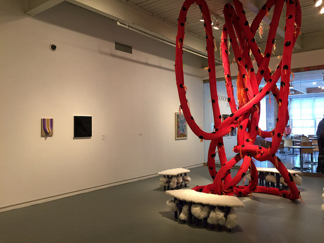
Installation view of the Sondheim Prize Semi Finalist Exhibition at MICA
MICA Fox Building
1300 W. Mount Royal Ave.
Baltimore, MD
Sondheim Semi-Finalist Exhibition
What’s on view: 54 Semi-finalists for the Sondheim Prize held inside several MICA Galleries. Lots of sculpture, lots of photographs, and a few paintings that made the short list for the Sondheim Prize, an annual open call juried exhibition for Baltimore-area artists. (This includes artists living in cities like Washington and suburban Virginia.) There’s no theme, and no attempt to forge one. All the galleries were crammed with work.
Michael Anthony Farley: Really, I think everyone has the same complaint every year: there is just too much stuff! Last year seemed a little better, but no matter what strategies are employed, the show just always feels overhung and uneven. Which really can’t be helped when there are around 50 semifinalists. In the past, artists who have been in the semifinalist exhibition have felt (justifiably) disappointed. It doesn’t make anyone’s work look good when it’s shown in a crowded room with work that isn’t always on the same level in terms of optics, production value, level of finish, etc.. One solution could be to name less semifinalists, which sounds like a bummer, but would make the distinction more meaningful for the chosen artists and would make for a much better exhibition for all parties concerned. Maybe limit the show to 20 (or less) really solid artists? Or, they could scrap the idea of a curated group show all together and give each semifinalist their own booth, similar to how MICA converts their classrooms to exhibition space for thesis exhibitions earlier in the summer. Or even on the upper, unused floors of the same parking garage as the art fair! Because, truthfully, the current model here in the Fox Building has not worked out very well.
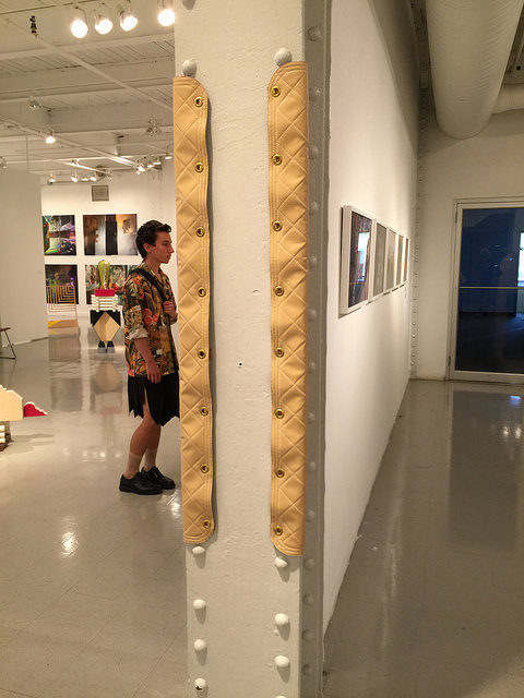
That isn’t to say that there isn’t a lot of really good work here, it’s just all hard to identify and appreciate in the swarm. The most successful pieces almost gave up on trying to stand out in the crowd and instead assimilated into the exhibition infrastructure. I’m thinking of David Page’s obsessively-crafted padding that wraps sharp corners or columns in the gallery—like it’s coddling the viewer. It’s very institutional, but I think you described it as “sexy” at the same time, and I totally get that.
David Page at the Sondheim Prize Semi-Finalist Exhibition
Paddy Johnson: Yeah, that work was bound and used grommets and rope and leather. It definitely sexes up what would otherwise be a stair railing or support beam. It was definitely a stand out.
Honestly, I think you’re being overly-generous to this show. It was terrible. It’s not that hard to select more work from fewer finalists or just fill fewer galleries. Being one of 50 semi-finalists doesn’t mean anything if the show’s full of middling work that does little more than overshadow the strong stuff.
The biggest issue with this show was the number of sprawling sculptures that filled the last section of the gallery. Simple things, like getting rid of the red polka dot octopus-like hanging sculpture surrounded by fur benches and the lumpy blue pinecone disease in the corner would have improved things. Even in a basic description this work sounds bad.
Surely, the curators didn’t have much to work with, but they did themselves no favors by pairing these enormous sculptures with quieter works. Danielle Mysliwiec’s small woven paint pieces were completely overshadowed as were the stark angled paintings of buildings by Lillian Hoover. The show looks as if the work was arranged by the order it came out of the truck.
Michael: Oh, I totally agree. I think I might have had a slightly better experience only because I had an idea of specific artists whose work I wanted to see going in there. Then again, I was also probably more frustrated by the display issues surrounding those. I feel like this was almost exactly how we felt when we visited Select Fair.
Paddy: Ha! Well, Select Fair was worse. I guess that’s the positive here: Unlike that event, there were no ladies in tins pouring milk on themselves, and no screeching guitars.
Michael: Well, at least not inside. Weirdly, the rock opera happening next to the Artist Run Art Fair seemed complimentary there!
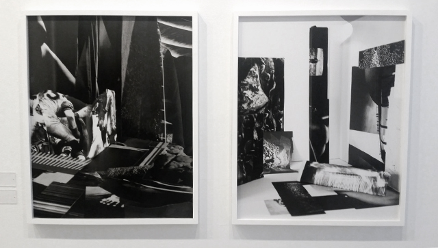
Ginevra Shay, ”Raum Bilder 3” and “Raum Bilder 4” inkjet archival prints, 2014.
At any rate, there were some highlights. I think Ginevra Shay’s collages are great. I couldn’t tell if they were photographs of three-dimensional models built out of cut-up prints or a digital collage. They’re really nice as compositions that almost reference interior spaces, but that uncertainty and play with materiality was what made them really memorable. I was also intrigued/confused by Hasan Elahi’s digital prints of Dick Cheney’s Maryland house. They read like real estate listing photos, but were they digital paintings? Photographs of paintings like one would have outsourced to an assembly line in China? The way they were hung really bothered me, but I would’ve loved to see a gallery with just work from Shay, Elahi, and Seth Adelsberger. All three play with the relationship between the screen, the artist’s hand, and perception of process in totally different ways—all with really solid conceptual underpinnings. Smart work like that just got lost in the fray—and lost something due to display issues.
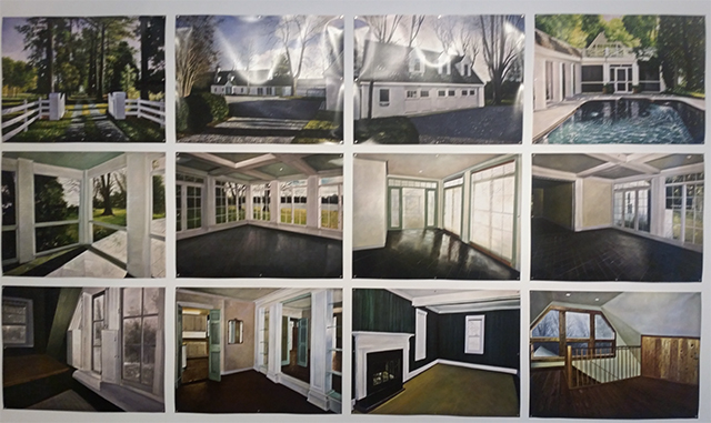
Hasan Elahi, “An Undisclosed Location (Cheney Residence, St. Michaels, Maryland)” C- Prints, 2012
Michael: At first, I couldn’t tell if I liked these or not. But that’s usually a good thing. Mostly, they seem like a big departure from Elahi’s other semi-autobiographical work I’m familiar with. The artist has been documenting his own movements for most of “The War on Terror” after being detained over a case of mistaken identity. He self-surveils in an apparently tongue-in-cheek demonstration of the fact that he is truly, definitively not a terrorist. But these appear to be real estate listing photos of Dick Cheney’s home. Elahi turning the tables on the right-wing security-state? Why do they look like cheesy paintings? Why are they presented on such crappy paper with magnets? Is this a meta-attempt to further comment on the value of anonymity by blending in with all the other schlocky work here? So many questions… so little room to think in this gallery.
Paddy: Yeah, these works are easier to evaluate now that we’re outside the gallery. What’s most astonishing to me about this work is how little emotion there is to it. If there’s any misery remaining in this home—and you know Cheney heart of darkness spoils everything it touches— these paintings remove its effect. I actually started to wish I could see the original photographs because they might reveal some of the bleakness in that location.
The paintings reminded me a little of George Bush’s paintings. They’re obviously more skilled, but like most of what Bush paints, they still seem like an exercise. Which brings us to your question about why they were painted and then printed in the first place. I just don’t know.
Seth Adelsberger “Untitled (Rift)” and “Untitled (Plato’s Cave 3)” 2015.
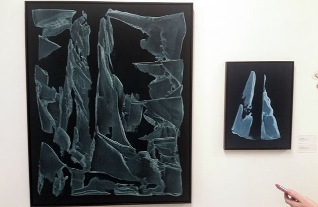
Michael: These paintings are made by impasto application of gesso on canvas, which is then dyed to highlight the surface’s topography. They’re designed to be photographed digitally—a backlit screen intensifies the “glowing” illusion in each canvas. We saw one like this at NADA this year too. I think they work better as huge canvases, where their unique materiality is more evident and they dialog more with all-over abstract expressionist work and industrial-scale printmaking. Seth is one of the several artists in the show who definitely deserved more wall space at the semifinalist show—these were easy to miss and not as powerful as they usually are on account of being tucked away in the corner of a room full of loud, crafty work.
Paddy: The minimalist approach to these pieces works well. They look like relics, so they have an air of importance to them that they wouldn’t have if they weren’t so restrained. I actually thought of Paul Sietsema when I looked at these, whose work is about returning significance to art making, because they do look so weighty. You end up assigning meaning to these forms whether you want to or not. I saw the picture on the left as an ice formation and the picture on the left as a sail boat. This kind of thing has limited returns, but since the pieces seem so intentional, I thought it worked.
Michael: That’s so funny! Everyone sees something different in these. The first time I saw them, I thought of the still life updated to the aesthetics of TSA luggage scans—a contemporary index of one’s possessions.
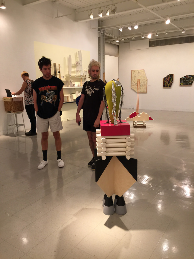
Kyle Bauer, Installation view.
Paddy: Kyle Bauer’s carnival-esque sculptures made with laser cut wood, shiny tassels and dowling are a tad clunky for my tastes, but they deserve a nod regardless. They were one of the few pieces given enough space to actually appreciate the work, and their jovial tone lifted an otherwise more somber show.
Michael: I’m not sure these are as successful as Bauer’s similar work at the Walters last year when he was a finalist. I guess they make sense at an award-centric show—they’re a sampling of design cues that tell us to applaud an achievement, from “Go Team!” all the way down to “BLAST OFF!” But here I didn’t feel like celebrating for some reason. Maybe, because they’re so clean, I’m just reading them as design objects that are too busy to be beautiful? I like them better when I think of Christmas or Fourth of July decorations that have been left up from last year. I bet they’d look great with a little patina/neglect.

Comments on this entry are closed.