
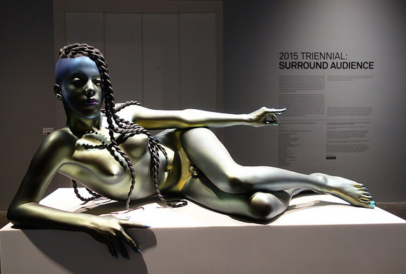
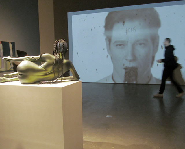
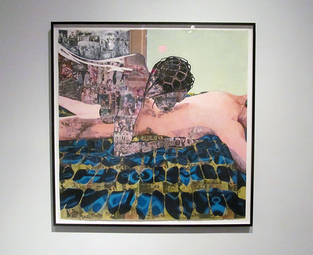
Welcome to the New Museum. Frank Benson, “Juliana,” 2015.
Corinna: As the elevator doors slide open to the second floor entrance of Surround Audience, you’ll be confronted with a shiny, flawless butt: Frank Benson’s “Juliana,” a sci-fi, Afro-futurist, hermaphroditic portrait of artist Juliana Huxtable. Her prints and poetry hang on a nearby wall. Her gaze is confident; her recline, too, seems purposeful. The artist does not, obviously, have green skin; this is just how she wants to be portrayed, imagining what beauty can be. The presentation, though, doesn’t diverge much from the already-known “hot alien” trope in sci-fi, or the classical reclining nude. No, we don’t all need to be covered up in a neck-to-toe robe like Princess Leia. But if the ideal is all surface—just body—that sounds like an ugly future. (Corinna)
Corinna: For several seconds, Ed Atkins’s video “Happy Birthday!!” (2014) lines up a particularly unsettling juxtaposition of the buttoned-up, American Psycho-type protagonist drowning in his own vomit while staring out at Juliana Huxtable’s futuristic portrait. He’s tortured by anxiety, she’s confident in the digital.
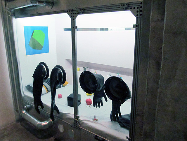
Nadim Abbas, Chamber 665 “Spielberg,” 2014/2015
Corinna: I had a lot of fun with Abbas’s three chambers. You can stick your hands inside the thick black gloves and move objects around. This one has geometric objects, some that look like chromosomes, that you can stack atop each other. Another room has toilet paper rolls you can throw around. It’s still an absolutely deadpan vision of a sci-fi future; the chambers remain uninhabited.
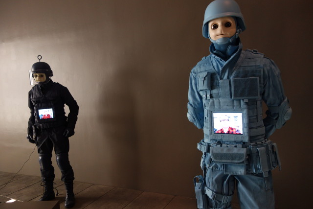
Josh Kline, “Freedom,” 2015
Corinna: Everyone’s already talking about Josh Kline’s Teletubby SWAT team. Four Teletubbies play videos of former police officers reciting recent news items (including their URLs); “Hope and Change,” a video of professional Obama-impersonator digitally altered to look like a Teletubby—that’s what I think, although mostly Obama looks like he’s made to have big, anime eyes—recites the 2009 Inaugural Address; and a cell-phone tower transformed into a tree with credit-card leaves. Nobody can fault Kline’s work for being insular, though I’m not sure what exactly Kline is targeting with his vision of a Teletubby alternate reality. It’s worth another outing to the New Museum.
Paddy: How is this work insular? To my mind, piece is a visual representation of the online identity: constructed, but incomplete. Obama, plays the role of the puppet. Communication is funded by our own debt, and that reality is hidden from us. It’s not even that far from reality; there are actual cell phone towers that are disguised as trees on the highway. They look weird, but I’m glad someone thought that we might not want to look at ugly towers on our commute.
Anyway, I thought this was one of the best works in the show. It’s a really smart visual representation of how we experience the digital world.
Corinna: Ooops. Not sure if I was clear enough. I meant that relative to other works in the show that seem to fetishize materials, especially in regards to painting—like Olga Balema’s water-filled sculpture-paintings, Eloise Hawser’s lithographic-plate paintings, or Jose Leon Cerrillo’s empty-frame paintings— Kline’s work is the least insular, least navel gaze-y work in the show.
You don’t need an art degree to get something out of it. I could bring a group of school children, the guy that runs my bodega, or one of my sisters to the exhibition and they’d probably have a lot to say about this work. Like you mentioned in your artnet News essay, “the exhibition takes a look at how technology affects us, a focus that mercifully puts a plug in New York’s seemingly endless supply of non-objective abstraction.” That’s true. It’s been a long time since I walked into the New Museum and didn’t feel like the majority of the works were made for an art fair. (Though, no doubt, squiggles, classical Greek collage, and pretty paintings all made an appearance.)
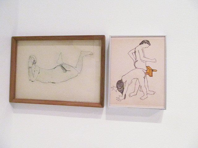
Shreyas Karle, “He-she object” from the “Museum Shop of Fetish Objects,” 2012.
Corinna: Just wanted to point out a dildo. A funky dildo that works best while dancing?
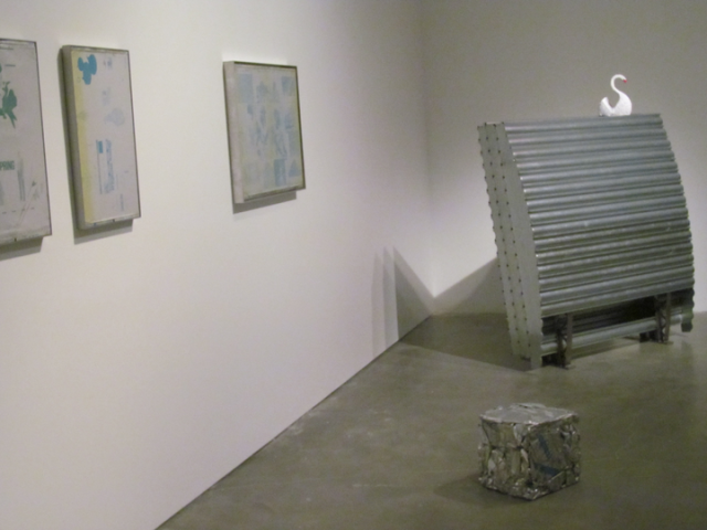
Several works by Eloise Hawser
Corinna: Paddy and I were chatting about how some of the least convincing themes set forth in this exhibition are also the quietest. For one, there’s a process-based nostalgia, involving the reuse of everyday or antiquated tech. This cube, Eloise Hawser’s “Untitled” (2014), a crushed lithographic plate, annoys me more than any other work in the exhibition. Hawser rescued previously used lithographic plates—some used in advertising—from the trash bin. Their fate, as a technology made obsolete, has been “redeemed” through a transformation into art. Turning trash into a Minimalist cube is not redemption. It’s like melting down old vinyl records to turn them into bowls, except that Hawser’s lithographic plates remain useless. In fact, the plates are doubly useless; first, trash, second, art.
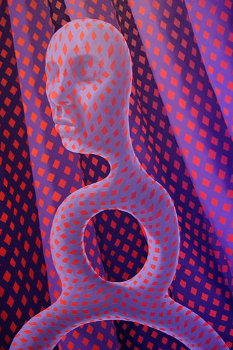
Close-up: Sascha Braunig, “Strider,” 2014
Corinna: We’ve reviewed Sascha Braunig’s surrealist, op-art panels on the blog before, back in 2013. We liked them, but we noted that “up-close, some of the paintings are less elegant and detailed,” and that while “the melding of genres is successful…there’s room for improvement.” In general, the Triennial has very little in the way of painting; that’s one reason why Braunig’s panels, despite their smallish scale (two feet wide or less), stand out. They do relate to one of the Triennial’s themes, of sci-fi as a tactic of distorting, changing, (or queering) the human body.
Corinna: I overheard a woman, a collector, probably, discussing the lighting on the Braunig works. As you can tell, there’s no direct lighting on the work; the purples and pinks emanating off of Antoine Catala’s “Distant Feel” (2015) light up the painting. The collector liked the current lighting situation; I have to agree. Braunig’s sometimes distractingly detailed brushwork gets drowned out under the fish tank’s glow, giving off the impression of digital mastery.
Paddy: I dunno about that. The color in this work is actually pretty important, and that’s compromised by placing these works beside a bunch of purple lights. I do agree with you that the brushwork benefits from this lighting—she’s skilled, but not painting at a John Currin level—and I actually appreciate seeing the inconsistency. It’s good to know a human painted these pieces.
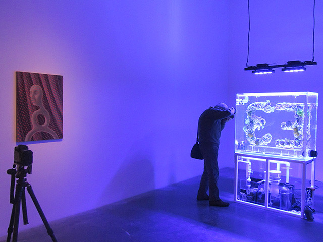
Corinna: About Antoine Catala’s “Distant Feel,” the “3E” is supposed to be a new symbol for empathy. With our country, and world, suffering from Ferguson, income inequality, and all other forms of political division, we could all use some more empathy. But will “3E” catch on in cultural parlance, like the peace sign ( ☮ )? Maybe, but only if Catala takes it out of the gallery, and creates a viral marketing campaign, or at the very least a hashtag. Otherwise, it’ll be just another luminous effort, left to spend its life alone in a gallery.
Paddy: Did Catala’s work remind you at all of Glenn Kaino at Prospect.3? I mean, there are differences for sure. Kaino was growing coral and referencing the military habit of dumping decommissioned gear in the ocean. This is supposed to be an advertising campaign with no product except feeling submerged in a fish tank with coral. Other artists who work with ads: The Propeller Group’s proposed ad for the Super Bowl (though it promoted a message—“new communism.”) Other artists who work with logos: Cloaque. Both use two letters, one of which is reoriented to create a logo. I’d take Cloaque and The Propeller Group over Catala. It’s more directed, which I think is important for an ad campaign. I didn’t walk away with any special “feeling”—I barely remember the piece at all—so I don’t think it achieved its goals.
Njideka Akunyili Crosby, “Thread,” 2012
Corinna: Nice use of materials going into the skin and fabric patterns here.
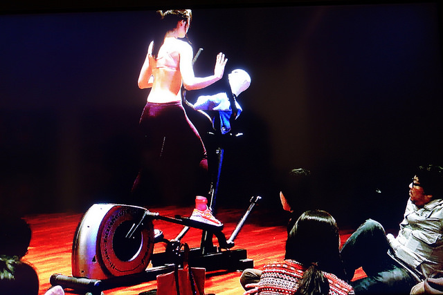
Paddy: Not sure if you caught Geumhyung Jeong’s “Fitness Guide” but what a good inclusion! In this video she graphs heads onto various exercise machines. Here, you can see her on a stairmaster working—she looks like she’s trying to catch up with the head. Very funny, and kinda overlooked in this show. She’s right behind Guan Xiao’s Instagram friendly installation which lays out sculptures made of camera parts, snakes, and ancient heads on patterned backdrops. It gets lost.
Corinna: Unsurprisingly, I overlooked this work. Why? Because it was on a standard-size TV monitor in a corner.
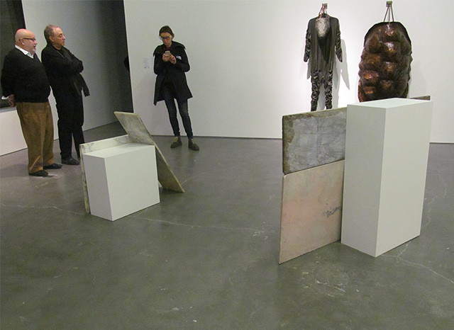
Foreground: Ane Graff, “The Blow” (2013) series; background: Eduardo Navarro, “Timeless Alex” (2015)
Corinna: Panels leaning against pedestals. Where am I? An art fair?

Paddy: I can appreciate the desire to include a comedian in the show, but why not someone who’s actually funny? Jayson Musson’s Hennessy Youngman is a pretty good example of that. Casey Jane Ellison’s skits look like they’re still in progress; they aren’t funny. Her stand-up routine, delivered by a 3D-rendered, animated self-portrait, begins with an explanation that she grew up privileged and now has a fear of growing bald.
“I saw a wave of fear [amongst the women] in the room [audience],” she observes after having divulged her secret. “Are there people who have that fear? Because we’re not fucking talking about YOU here.”
That’s pretty much the best joke that gets told, and it’s not that funny, and it’s cliche comedy to boot. The show is a series of female anxiety jokes about her fake husband and choice to wear eggplant lipstick that culminates in the false proclamation that she loves the audience. Meh.

{ 6 comments }
Just to suggest some edits:
>though I’m not sure exactly Kline is targeting with his vision of a Teletubby alternate reality.
I think you’re missing a “what” here.
Also, IIRC, i think Antoine Catala’s work uses the symbol E3 as it references two “E” letters facing each other, thus signifying empathy. (not 3E)
http://press.cmoa.org/2015/02/16/distant-feel/
Hi Sven,
Friendly copy advice is always useful.
About Catala: yes, in other works by Catala with the logo, two “E” letters face other, but that’s not what this sculpture in particular shows.
Just to clarify—and this might be somewhat confusing—the work looks like 3E in the New Museum. Look at the photo. When you see the work, you see the letters presented, read left to right, as 3, then E.
Lots of discussion about this now in the office, because if it’s actually supposed to E3, then its front is facing a wall, which is weird.
yeah i think the wall text said E3 which means that you had to go “behind ” the sculpture to read it the “right” way, which is how I perceived it when i was there in person.
The photo above shows a backwards 3 followed by an E. Not “3E”.
Comments on this entry are closed.