2015 was great for art. For all the bitching that went on about art fairs, the dominance of the market, and sub-par museum shows (cough, cough Björk), I saw more great shows than I have in my ten years working as a critic in New York. Rather than try to whittle our picks down to a few select shows, we wrote up every show we thought was truly exemplary.
The result is 24 truly outstanding shows organized in the following clickable categories:
Best Performance, Best Museum Shows, Best Pavilion, Best Artist-Run Shows, Best Alternative to Soul-less Art Fairs, Best Gallery Shows, Best Digital Art Shows, Best Exhibition Concepts
BEST PERFORMANCE
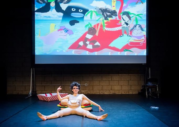
Dynasty Handbag
Dynasty Handbag’s Soggy Glasses: A Homo’s Odyssey at American Realness. Review here.
If I could watch this performance twenty times I would. Jibz Cameron’s character Dynasty Handbag plays the role of a migrant ego trudging through the insides of her own body to examine her deep-seated depression. Every stereotype about artists, lesbians and contemporary life gets skewered. As Whitney Kimball diligently laid out for AFC, “highlights include: a tribute to her vagina set to Aretha Franklin’s “Natural Woman”; a character’s declaration about not being a cyclops; Handbag chasing an imaginary mate with a strap-on, grumbling.
The whole performance is so inventive; when you’re not laughing you’re marvelling at how smart Cameron must be to have spun it together. If you have a chance to see this performance, ever, drop everything and do it. It’s that good. — Paddy Johnson
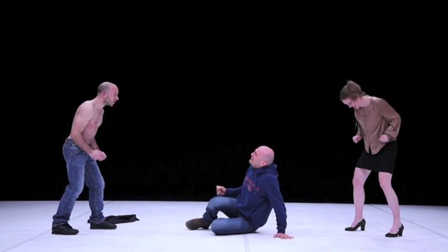
Ivo Dimchev, Performance shot, “Fest”
Ivo Dimchev, “Fest” at American Realness. Review here.
Art world politics have never been so revolting. In this play by Ivo Dimchev, we learn that nothing gets done without a blowjob or fuck, no matter how long it’s been since the recipient’s last shower. Sexual politics lubricate the art machine, which according to Dimchev’s vision of the world, couldn’t be more broken. It’s a bleak story, but hilarious for its absurdity. Watching it felt like being sprayed with golden showers. — Paddy Johnson
BEST MUSEUM SHOWS
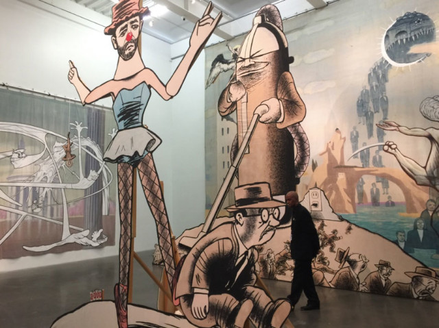
Jim Shaw’s The End is Near, installation view from the fourth floor
Jim Shaw, “The End is Near”, The New Museum. Review here.
If we’re Rome, Jim Shaw’s The End is Near is four floors worth of our Nero fiddling. For his New Museum retrospective, Shaw filled an entire floor with creepy thrift store finds from banners to playing cards to paintings—many of which were either apocalyptic in tone or espouse some creepy racist or revisionist message. Another floor showcases Shaw’s paintings and drawings, all rendered in whatever style suits him.
As a craftsman, his skill is astounding. The show’s success relies less on that skill though, then it does his inventive spirit and sustained focus and eye for the most corrosive elements of American culture. Shaw’s show suggests he may not have much hope for our future, but I left with my faith in art’s critical functions reaffirmed. — Paddy Johnson
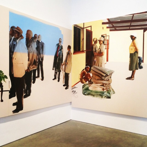
Meleko Mokgosi at the ICA Boston, Installation view.
“Meleko Mokgosi: Democratic Intuition” at ICA Boston. Review here.
Meleko Mokgosi’s solo exhibition at the ICA Boston was tiny—just one gallery packed with irregularly-shaped canvases crammed end-to-end around the walls—but the impact was huge. Their scale and vague suggestion of incomplete landscapes, horizon lines, or architectural features transformed the space into a wholly immersive, foreign environment populated by painterly figures coming in and out of focus. It was a great installation, and as individual panels, each canvas was a stunning painting. Collectively, the disjointed narrative recalled cinema or a non-sequential comic strip, but it’s origin was based in collage and appropriation—each vignette was assembled in New York out of newspaper clippings from Mokgosi’s native Botswana. I can’t think of another artist who has used oil on canvas as originally and evocatively in recent history. Democratic Intuition made me want to visit Botswana, and for a brief moment, it felt like I had. — Michael Anthony Farley
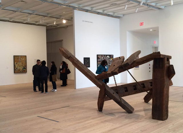
The New Whitney installation view
The New Whitney building. Review here.
I hated the old Whitney building and actively avoided it. If there was a show I thought I could skip, I’d do that. Sometimes, I would procrastinate going out to shows I wanted to see long enough that I would miss them entirely.
No more. The Whitney’s new building may have the facade of pharmaceutical giant, but the inside is full of light-filled galleries dedicated to showcasing one of the country’s most important art collections. And thank God—now that art collection really sings. In broad chronological and thematic strokes, the permanent art collection tells the story of America and American art-making from European Modernism to ’50s abstraction ’60s pop art and the rest of the 20th and 21st century. Our country’s most important art collection is now properly showcased for the public. I can’t think of a better outcome for this collection. — Paddy Johnson
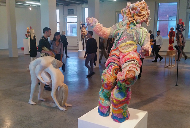
PS1 Greater New York, Installation view.
Greater New York at PS1. Review here.
What can be said about this year’s iteration of Greater New York that hasn’t been said before? The recurring survey of New York’s past and present art-making was a lot like the city itself—sprawling, diverse, inconsistent, crowded, funny, heartbreaking, and dripping with bitter nostalgia for the days before AIDS, terrorism, and gentrification bleached Manhattan of its subversive glamour. But while this show felt like a eulogy—or perhaps a rallying cry to save/recapture what really is/was “great” about New York—it also offered undeniable evidence that the city will always attract, inspire, and incite critique from new generations of artists, even if they can’t afford to live or work here. — Michael Anthony Farley
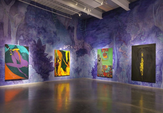
Chris Ofili, installation view of “Day and Night”. Forth floor.
Chris Ofili, “Day and Night” at The New Museum. Review here.
This show opened in 2014, but because it closed in 2015 we feel safe adding it to our 2015 Best of List. And what a doozy. There may be no painter with a better mastery of color and texture than Chris Ofili. Color combinations vibrate in these large-scale figurative works that reference Matisse, Blaxploitation, religious icons such as the Madonna and psychedelia. Much of the subject matter of these works centers on black identity, fertility, and how landscape both informs and provides a backdrop to these themes. Perhaps the most striking quality of this show, though, was the sheer volume of work that dazzles the eye. Nothing did that better this year. — Paddy Johnson
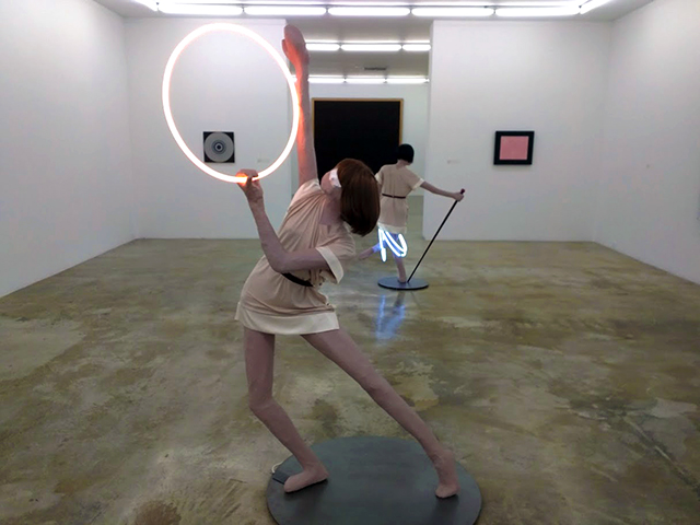
Installation view.
The Rubell Collection, “No Man’s Land”, Review here.
Women, from Cindy Sherman to Katherine Bernhardt, make a lot of the art out there. And a lot of it is awesome. That’s pretty much the guiding curatorial ethos of this show, which features over 100 female artists from the Rubell collection. The resulting exhibition refreshingly felt as if it had nothing to prove, except, perhaps, that the Rubell Family has great taste and enough money to match it. I can’t recall another exhibition that made me so giddy, skipping from a gallery with an Isa Genzken mannequin to a room of portraiture with beautifully washy and intimate Elizabeth Peyton portraits. I’m not sure where the stereotype that feminists don’t have a sense of humor came from, but when there’s no dudes in the room, artists sure seem to have a lot fun. From process-intensive to playfully absurd, this show restored our faith in the joy of making and viewing art when we needed it most. — Michael Anthony Farley
BEST PAVILION
Joan Jonas’s Venice Biennale Pavilion.
I found Okwui Enwezor’s All The World’s Future curatorial direction for this year’s Venice Biennale to be exhausting: an over-blown culmination of neo-liberal aesthetic idealism that would have vastly benefited from an edit. Flawed as it was, experiencing the Biennale off-season was worth it for Joan Jonas’s multi-media installation, They Come to Us without A Word. Walking around the five rooms of the US pavilion, I found myself quickly cast under its witchy, elemental spell.Snatches of images stirred confused and overwhelming emotions: a projection of children playing dress up in white ceremonial robes, artifacts laid on the ground of their play acting, cave-like ink drawings of bees and fish, the sound and play of shadow from fun-house mirrors. It drove home the point that we repeatedly enact the same forms of expressions as a feeble way to capture our surroundings. By the time I saw a home video of a dog paddling in a river, I was crying—shattered by an immersive experience that made me consider the sacredness of nature, and the fleeting yet enduring ties that bind us to memories and varied lineages. It was forceful, moving and honest work. — Rea McNamara
BEST ARTIST-RUN SHOWS
Chanel Von Habsburg Lothringen
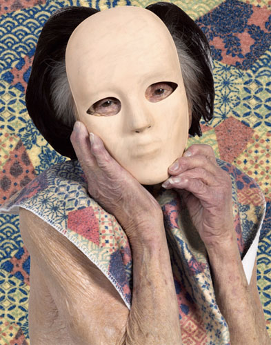
Chanel Von Habsburg Lothringen at Boyfriends. Review here.
I’m used to seeing masks like the one above worn by young serial killers, bank robbers and thespians. Place an aging grandma in one of these, and I don’t know what to think. I’m guessing that’s part of the point; disorientation appears to be part of Chanel Von Habsburg Lothringen’s objective. Like many of the pieces in this body of work, the aging woman strikes a pose from a popular ’70s ad. A viewer might not spot those references in the work immediately—before reading the press release, I found the work vaguely uncanny, but couldn’t explain why. The result is a kind of neutered consumerism that feels oddly performative—as if the models were teleported from another planet and were forced to try and fit into this strange work by miming it out. — Paddy Johnson
The Waasaic Project
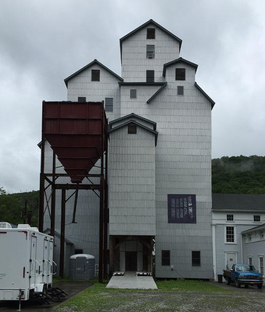
The Waasaic Project, “Deep End”, Review here.
If you drove two hours out of the city to Wassaic for the Wassaic Project’s annual summer show this summer you’d have won the art lover lottery. 60 present and former Waasaic resident artists blanket the Wassaic Project Mill with art depicting weird dystopic realities—and incredibly, almost all of it was good. Stand-out works included a latch rug cyclops owl, an obsessive crayon drawing of the world’s atrocities, and a lawn full of failed 3D architectural renderings. However, the true show stopper came from Corina Reynolds, who fully transformed the top level of the mill into an office space complete with a gray carpet, an air-freshener that smelled an office (think the smell of an inkjet printer) fake plants and office furniture. In the center of the room, a lit tower rotated, transforming the mill into a light house. As I mentioned in my review, the whole installation read like a venus-fly trap for office workers. — Paddy Johnson
Brian Belott
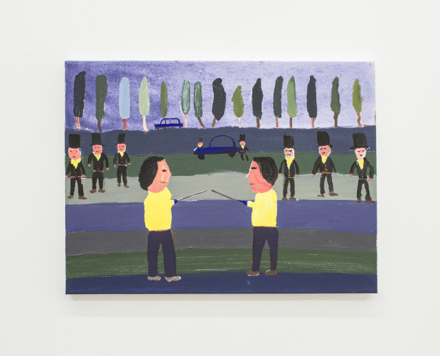
Brian Belott, “Dr. Kid President Junior” at 247365. Review here.
Consummate collector Brian Belott produced an exhibition of 34 counterfeit paintings of children’s art. Hung salon-style at 247365, these reproductions of reproductions draw from books on children’s art. Why go to the trouble of recreating all these images? It’s about finding ways to connect to viewers. “Kids stuff is worthless,” Belott told me earlier this year while explaining the importance of the exhibition. “And the original drawings and paintings are probably destroyed. I feel like the art world masters should all know these things, but I thought reproductions would be way less fun for the viewer.”
Needless to say, it worked. I looked harder at these paintings, some of which were more than 100 years old when originally rendered, than I would have in any book. And the exhibition came with a zine showing the various developmental stages of childhood drawing development. I can’t remember the last time I learned so much about drawing and painting from a single show. — Paddy Johnson
Theaster Gates’s Stony Island Bank. Installation view.
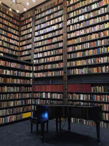
Theaster Gates, Stony Island Bank, Chicago
It’s impossible to overstate the significance of Stony Island Bank, a derelict bank Theaster Gates purchased from the city of Chicago for a dollar and transformed into a community library and event space. Gates fundraised to make all this happen, and in fact, the renovations are still going on; the basement vaults have not yet been touched. The library includes a lantern glass slide collection, thousands of books and magazines, and 5000 records bequeathed to the organization by the godfather of house, Frankie Knuckles.
The project addresses the neighborhood’s lack of hangout spaces without leaning on the most common signifier of gentrification: coffee shops. “I lead with how do we take care of this building?” Gates told me this September. “How do we get people involved without a hunger strike? Without the biggest political action we can imagine?” His solution? The bank. “We can do this.” he continued. “You just don’t have to care about making money. The rewards are emotional and spiritual.” — Paddy Johnson
BEST ALTERNATIVE TO SOUL-LESS ART FAIRS
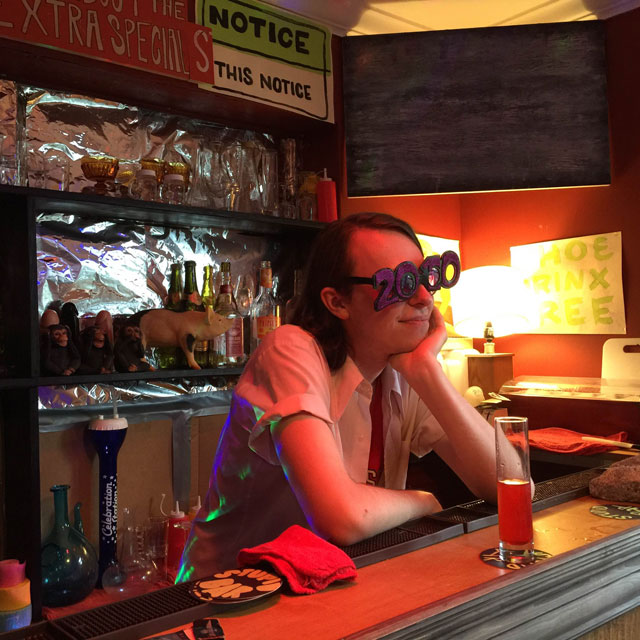
Stupid Bar at Artist Run
The Artist-Run Art Fair at Artscape, The Art Fair that Didn’t Suck, Putting Artists First at SATELLITE.
From a parking garage on the fringe of a street carnival to a long-vacant hotel many blocks from Art Basel Miami Beach, artist-run satellite exhibitions injected some much-needed fun and criticality to otherwise bland 2015 events. Over the summer, we crowned Open Space’s Artist-Run Art Fair in the shadow of Artscape Baltimore “The Art Fair that Doesn’t Suck,” We loved it so much, we invited many of the galleries who participated to join us at The Artist-Run Show Tiger Strikes Asteroid organized at the SATELLITE Show in Miami Beach this month. With shoe-string budgets, artist-run spaces pulled off some of the most impressive art-viewing experiences we’ve had in recent memory—presenting smart, sometimes-challenging work approachably at accessible prices. This is a trend we hope continues for years to come. — Michael Anthony Farley
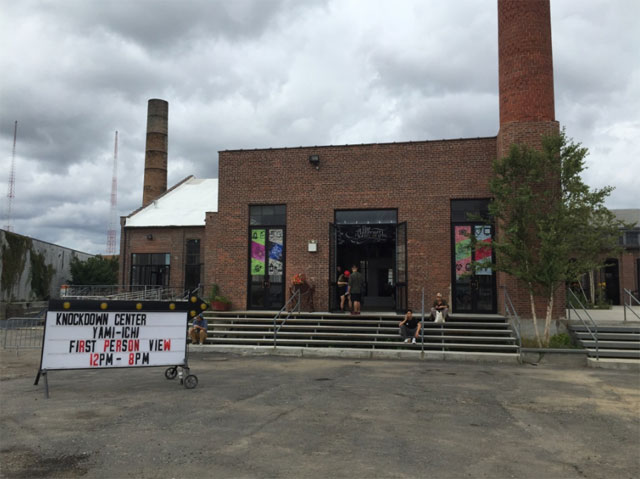
The Internet Yami Ichi entrance
This September, roughly 100 internet creatives became Yami Ichi venders at the Knockdown Center. Typically, they sold work designed to appeal to the senses of internet professionals—weird crap most of us would never think to make.
As proof, here’s a catalogue of ephemera I bought at the Yami Ichi Flea Market:
- Two used passwords for 25 cents a piece (lost almost immediately)
- Two Instagram prints printed at a resolution determined by the number of likes it received for $29 each.
- A plastic $5 USB drive containing animated GIFs
- Two free badges
- A 32 page coffee stained zine filled with Internet slang.
- a bitmoji rendering of my face.
Regrets: That I didn’t buy any of the $1 dollar memes available. — Paddy Johnson
BEST GALLERY SHOWS
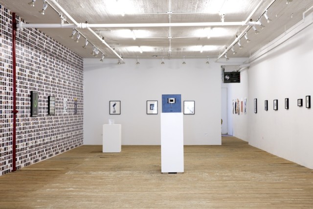
Lynn Hershmann Leeson, Installation view
Lynn Hershman Leeson at Bridget Donahue
Last February, Bridget Donahue launched a Lynn Hershman Leeson mini-retrospective with work ranging from 1968 to 2014. Nearly all of it looked like it could have been made today. Perhaps attribute this contemporary factor to half the gallery being covered in digitally printed wallpaper made in 2014 picturing genetically modified animals and food. But even without it, the early works would still seem current enough to give the show an uncanny feeling. “Hero Sandwiches” (1981-94) collages celebrity figures together to create mutant celebrities, while “Phantom Limb” (1988) replaces the head of female figures with TV’s, telephones, and other technology. They’re all feminist works, but in the context of the wallpaper—which shows pretty much everything to be mutable—the female body seems like it’s just another material to fuck with. — Paddy Johnson
Alex Da Corte
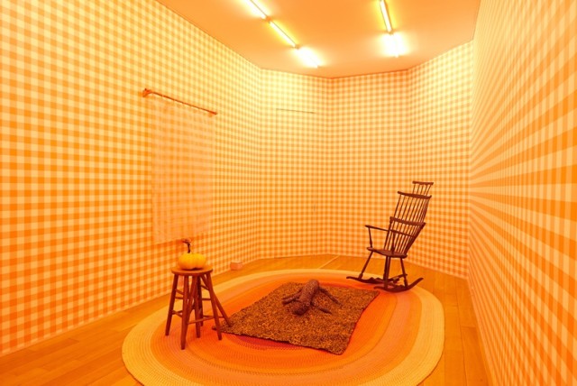
Alex Da Corte, Die Hexe, Luxembourg & Dayan
It’s hard to imagine a better looking work of art than the five room tour de force Alex Da Corte produced for Luxembourg & Dayan. Moving from dark to light, the installations show a near obsession with old and new-school Americana and an astounding dexterity with patterning. From a purple geometric floor gridding in the morse purple room to the buoyant orange checkered wallpaper, no other installation better communicated the character and shifting moods of American lifestyle and interests than Die Corte. — AFC Staff
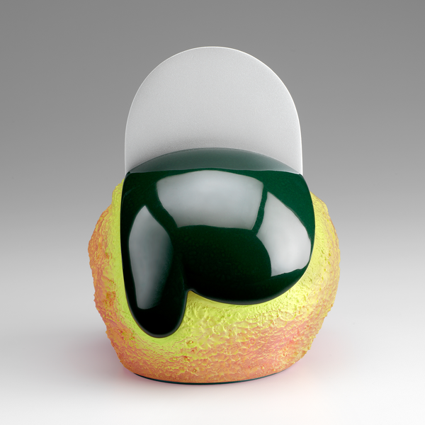
Ron Nagle at Matthew Marks. Work detail.
Ron Nagle, “Five O’Clock Shadow”, Matthew Marks
Ceramics is really gaining steam: critics near uniformly praised the 2013 Ken Price exhibition at the Metropolitan Museum of Art, and the medium is practically everywhere at art fairs. But this year’s Ron Nagle show “Five O’Clock Shadow” at Matthew Marks might have been the most loved show of the season—and not without reason. A master of texture, these tiny abstract ceramic pieces bring together smooth resin surfaces with rougher, more gravelly-like finishes. The results ranged from playful, to precious, to other-worldly terror. — Paddy Johnson
BEST DIGITAL ART SHOWS
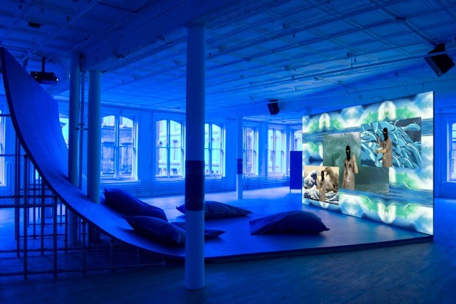
Hito Steyerl at Artists Space. Installation view.
Hito Steyerl, Artist Space. Review here.
I still remember the snow falling outside of Artists Space when I went to see their Hito Steyerl survey. The theme of the show seemed to be that data and narrative are as malleable as water. and that violence, money, and art are always connected. I couldn’t help feeling like the Steyerl had somehow engineered the weather.
There was a lot to see in this show—seven videos in total—and they take some work to interpret. Her PowerPoint lectures are fictionalized until they become fantasy; in “Museum is a Battleground” bullets and museums are even compared as though they had similarities. What’s crazy about this exhibition, though, is that by the end of it all, we learn that bullets and museums actually do have similarities. I learned more in this exhibition than any other this year. — Paddy Johnson
BiWay Art Foundation at the Wrong.
Imagine the Canadian discount retailer, BiWay, wants to establish itself as a foundation for the arts similar to the Prada Art Fondazione. The organization probably doesn’t have the best intentions—it wants to establish itself as luxury, but at a low cost—and it’s already got a pretty shitty reputation. (You can’t even get a decent pair of socks at BiWay.)
Enter curator and (full disclaimer) AFC writer Rea McNamara’s The BiWay Art Foundation, an online exhibition that invites 11 artist projects to imagine every possible marketing and art snafu possible. Lido Pimienta creates a series of drawings for her “residency”, which is so under-funded, the BiWay resorts to selling her drawings to pay for the program. Kcirred Reswob, a recipient of the BiWay art foundation grant, created a skeezy PowerPoint lecture intended to mirror the foundation’s ulterior motives by selling his “powers” as a spiritual guide. And Dustin Wilson and Ella Dawn McGeough, AKA Friends of Ogden Park, created a residency application that gives applicants low “creative” grades because they are too logical. (I got 17 percent.)
The point that comes through loud and clear with all the projects is that the projects aren’t about furthering conversations, but some idiotic brand. It’s brilliant satire, and sadly not too far from reality. — Paddy Johnson
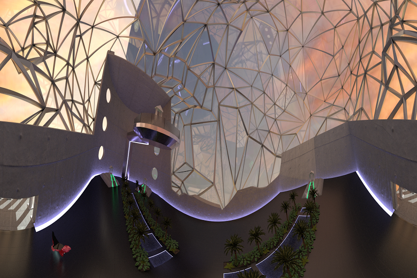
DiMoDA, screengrab
Alfredo Salazar-Caro and William Robertson, “The Digital Museum of Digital Art (DiMoDA)” at Transfer in Brooklyn and SATELLITE.
I “visited” the Digital Museum of Digital Art via an Oculus Rift in the middle of a dingy, abandoned modernist pharmacy during the SATELLITE show. After spending most of the week wandering around bland art fairs in tents, a convention center, and hotels, the break in monotony was appreciated. The experience felt like a scene from a William Gibson novel. But while art fairs sponsored by mega-corporations (complete with augmented-reality apps) where one must dodge plastic-surgery casualties wielding selfie-sticks on hoverboards are convincing arguments for a “the future is now and it is terrible” mentality, the DiMoDA restored my faith in technology’s potential to change the art world for the better. The headset transports the viewer to an alien beach, where a palladian museum beckons. Using a game console controller, visitors can enter the structure and approach and interact with digital installations by Claudia Hart, Jacolby Satterwhite, Tim Berresheim, and AquaNet 2001 (Gibrann Morgado and Salvador Loza). — Michael Anthony Farley
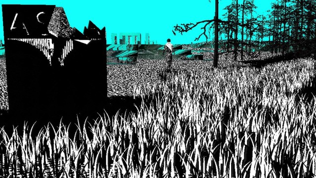
Peter Burr
Peter Burr, Cave Exits, 80 Greenwich Street. Interview here.
A giant cube made of screens hovered over me while I watched Peter Burr’s “Cave Exits” pan across its circumference. The video consists of bits of code, black and white landscapes and impossible to navigate labyrinths inspired by Andrei Tarkovsky’s 1979 masterpiece film Stalker.
It’s hard to explain exactly what makes this piece so compelling. Half of it is just the scale and complexity of the project. It’s an astonishing amount of graphics coding that will only grow. (Burr’s larger video project will be completed nearly 10 years from now.) For me, though, it’s the visual rhythm that makes this video so compelling. Code slides across the screen fast, then faster, then suddenly more slowly and in a new direction. It’s akin to what I imagine it would be like to watch music flow; beautiful, enthralling and at times, terrifying. — Paddy Johnson
Joe McKay and Kristen Lucas at Postmasters
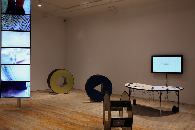
Joe McKay and Kristin Lucas, Away from Keyboard, Postmasters.
This was best December show I’d ever seen at a gallery. Typically, galleries reserve this time of year for exhibition filler, so I was please see two such strong artists fill the month, and even happier to see them live up to expectations. Scattered around the back gallery are Joe McKay and Kristin Lucas’s furniture-like sculptures, each designed to challenge common user experience. “OmegaMouse” consists of a table, six mice, and a screen. There’s nothing to indicate whose cursor is whose, and since the game involves you shooting at a bunch of incoming crap, you pretty much have to talk with other players to figure out how to play—perfect for an opening. On another side of the room, a 30-second video loop of waves covered by a huge target shaped watermark runs on rotation. It takes all of 30 seconds of watching this video before you start to feel nauseous.
All of these works require a high level of skill and craft, but their success lies in the fact that they elicit a response in me that’s strong enough to actually change my behavior. It’s rare when any art can do this, let alone a whole show. — Paddy Johnson
BEST EXHIBITION CONCEPTS
P! opening
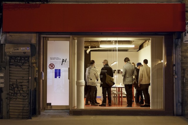
P!
P! is a look at what an expanded art world could look like, without the usual pop star pandering we see in Chelsea. Unlike their Chelsea and Lower East Side counterparts, who typically show artists with the similar art school education and post-grad occupations, P! works artists with hard-to-define practices; they are artists who are also designers, architects, writers, poets, and sometimes even chess champions. The result is a program completely distinct and needed within an art world plagued with sameness. — Paddy Johnson
Screengrab from Useless Press
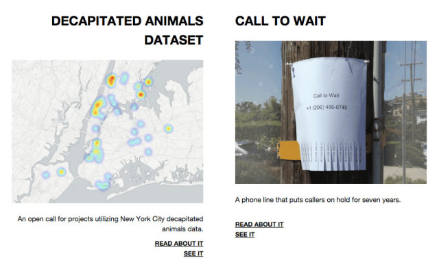
Useless Press
What do bloggers do with the weird information they stumble upon? Adrian Chen, Sam Lavigne, and Alix Rule founded Useless Press, an outlet for material that has no place in mainstream blogging. So far, they’ve placed a call to artists to worked with a decapitated animal dataset, a real time reinterpretation and writing of the Charles Dickens serialized novel, The Pickwick Papers, and a phone line that puts callers on hold for about seven years. — Paddy Johnson


Comments on this entry are closed.
{ 1 trackback }